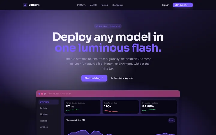
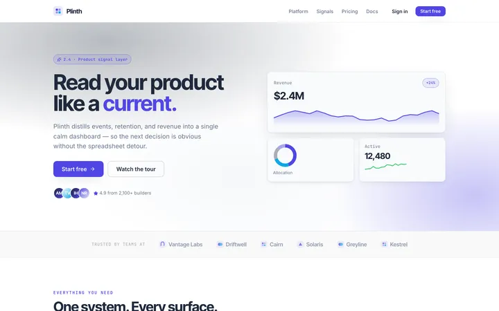
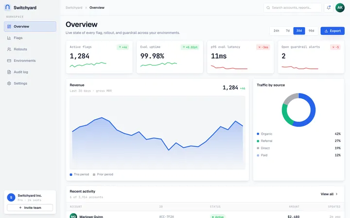
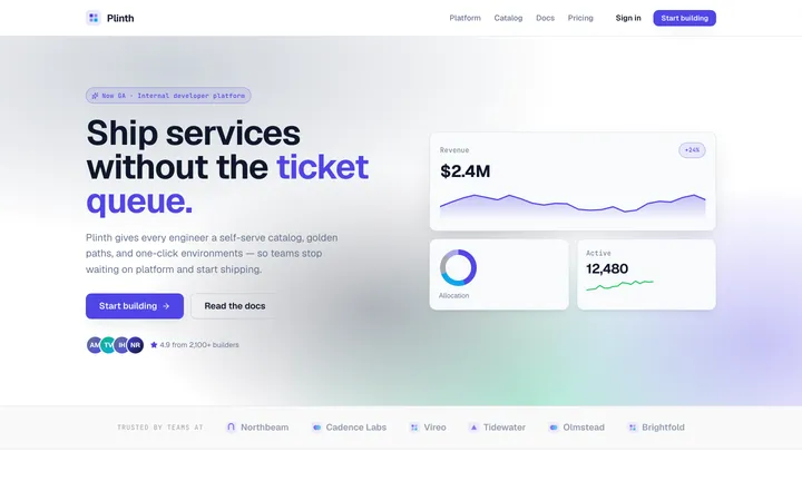
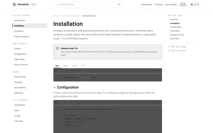
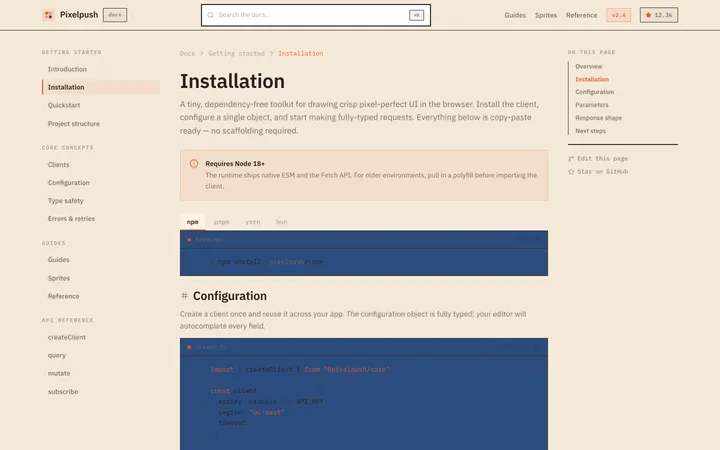
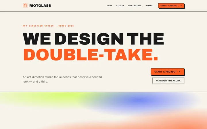
67 skills · 8 free
Design skills for Claude, Cursor & Codex
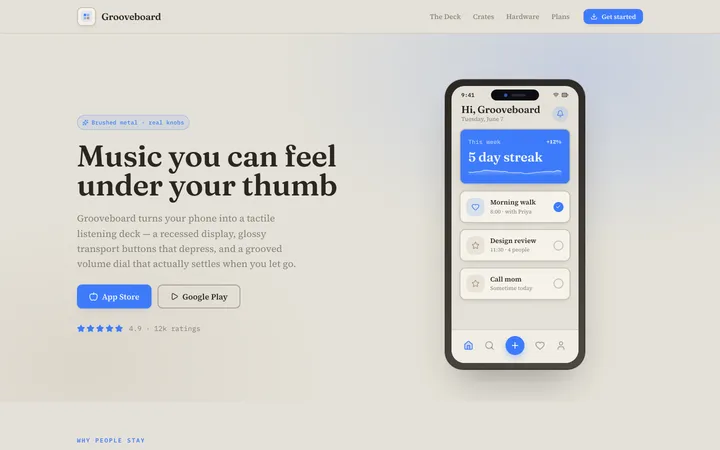
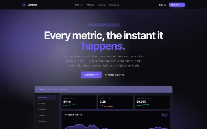
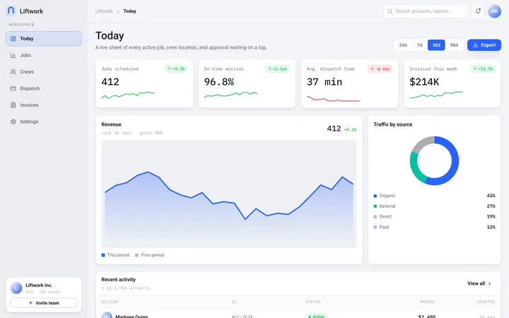
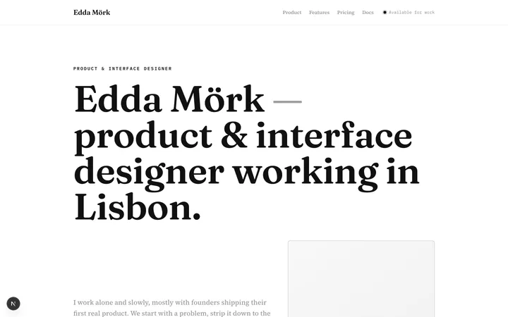
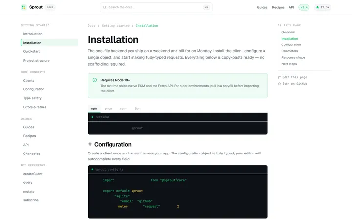
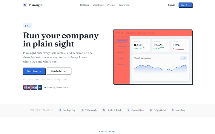
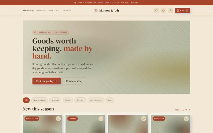
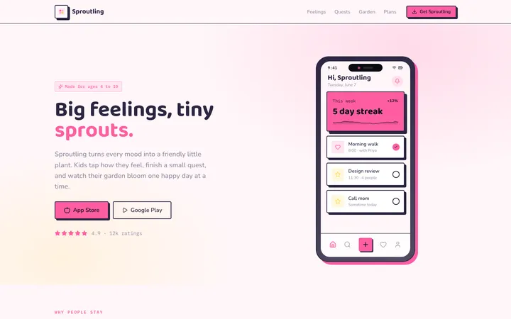
67 original design-system skills you install into Claude, Cursor, or Codex. Install one and your AI generates UI in that exact style — tokens, type, spacing, and components, all consistent.
67 skills
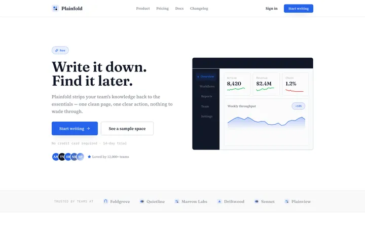
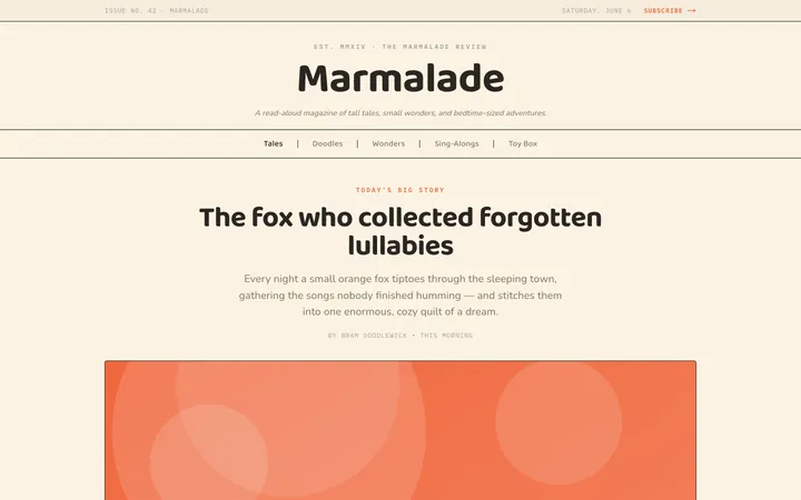
Paper
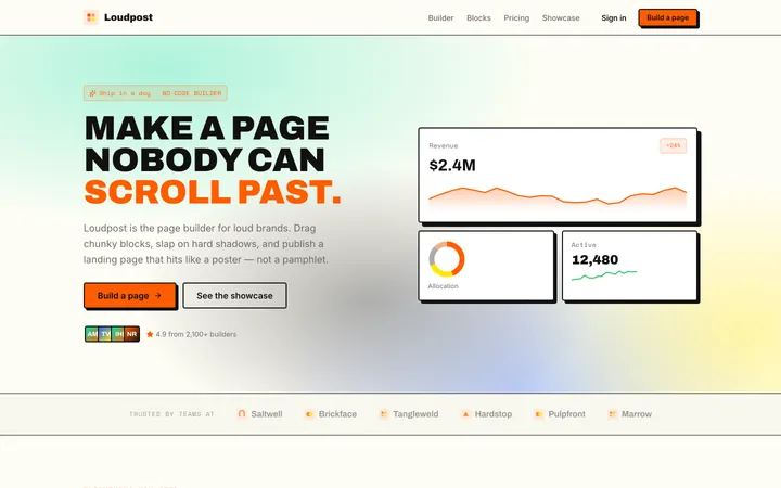
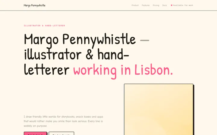
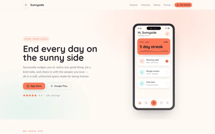
editorialA clean, tactile interface inspired by real sheets of paper—soft shadows, gentle layering, and generous whitespace that make screens feel calm and physical.
Neumorphism
aestheticA soft, extruded interface where elements appear to push out of or press into a single continuous surface using paired light and dark shadows.
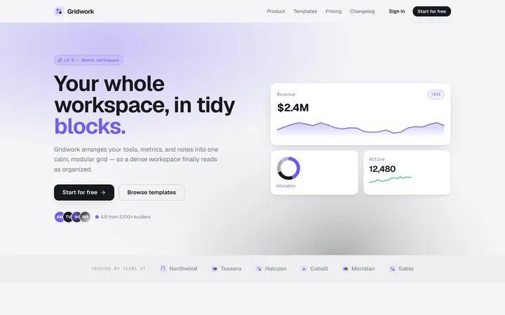
Bento
layoutA modular grid of card-like blocks with clear hierarchy and soft spacing that makes any content feel organized, scannable, and modern.
Artistic
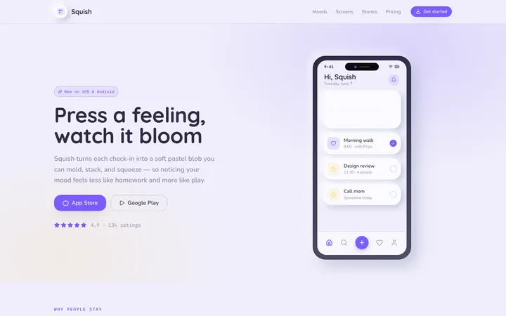
aestheticAn expressive, hand-made design system blending organic blobs, playful illustration, and unconventional layouts into interfaces that feel like a living sketchbook.
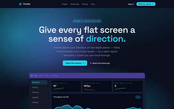
Perspective
aestheticA spatial design system that uses angled planes, layered depth, and foreshortening to give flat screens a dynamic, three-dimensional sense of direction.
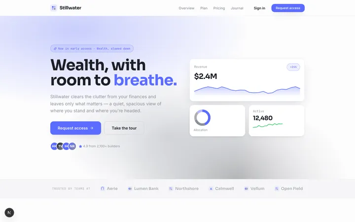
Clean
toneA minimal, distraction-free system where generous whitespace and crisp type let content do all the talking.
Premium
toneA high-end, exclusive look built on deep tones, gold-leaf accents, and serif-led typography that feels expensive on contact.
Refined
toneAn understated, professional look where precise spacing and subtle contrast turn small details into quiet polish.
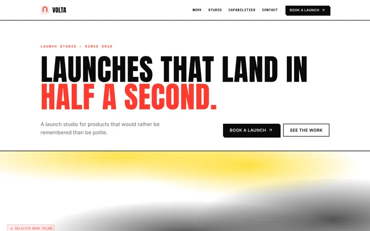
Neobrutalism
aestheticA loud, high-contrast look built from chunky shapes, hard black edges, and unapologetically blocky color that refuses to whisper.
Glassmorphism
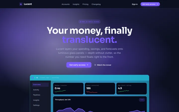
aestheticTranslucent frosted panels that float over colorful depth, blurring the layer beneath into soft luminous glass.
Bold
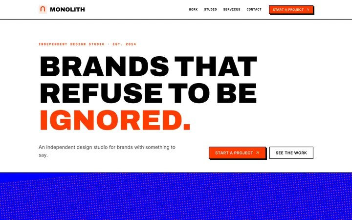
toneA high-impact look built on oversized type, stark black-and-white contrast, and confident blocks of saturated color that refuse to whisper.
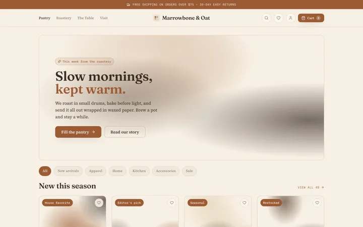
Cafe
editorialA warm, handcrafted aesthetic of roasted earth tones, soft paper textures, and relaxed serif type that makes an interface feel like a favorite corner table.
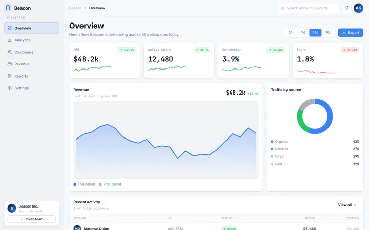
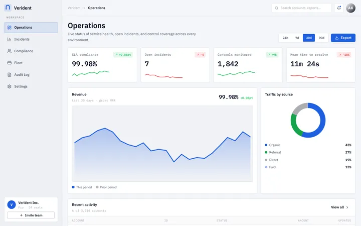
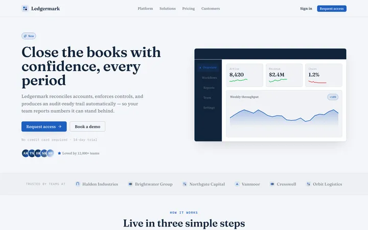
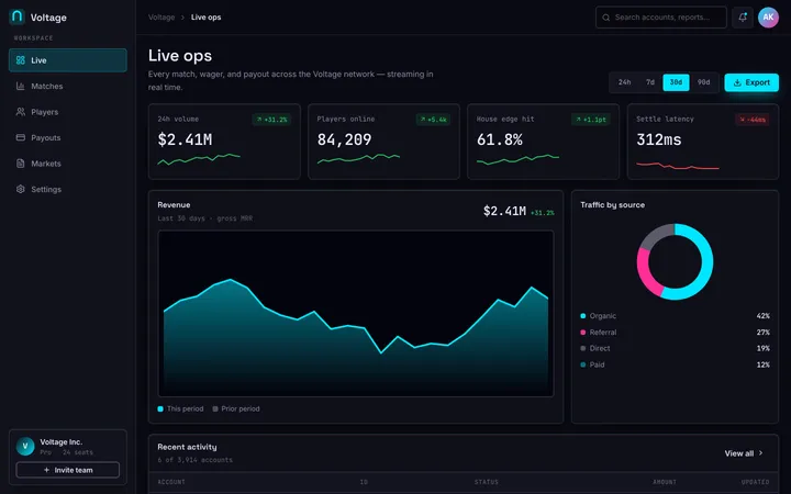
Dashboard
layoutA cloud-platform aesthetic of modular grids, glass-like panels, and crisp data hierarchy built for productivity dashboards that need to feel calm under heavy information.
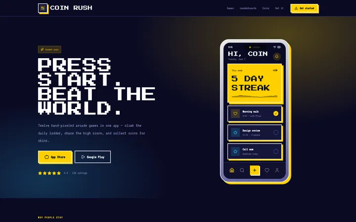
Chomp
retroAn arcade-cabinet aesthetic of chunky 8-bit pixels, vivid primary colors, and coin-op energy that turns any interface into a high-score screen.
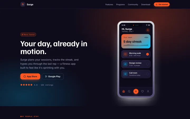
Energetic
toneA fast, kinetic aesthetic of vivid gradients, diagonal motion, and bold rounded shapes engineered to make an interface feel like it is already in motion.
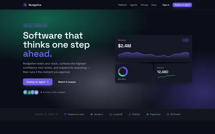
Agentic
aestheticA proactive, intelligent interface that surfaces next steps, adaptive feedback, and guided actions so users reach their goals faster.
Doodle
editorialA hand-drawn, sketchy interface full of wobbly lines and playful imperfection that makes products feel friendly, human, and creative.
Enterprise
toneA clean, high-contrast, information-dense design system built for serious enterprise applications that demand clarity at scale.
Professional
toneA clean, trustworthy, corporate-ready design system tuned for business applications and productivity tools that need to feel reliable.
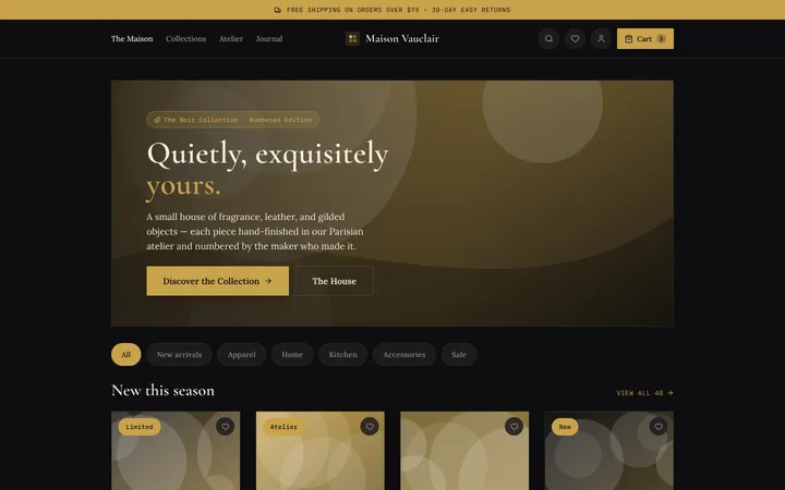
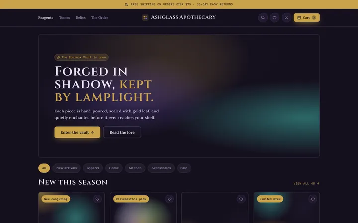
Luxury
toneAn opulent, refined design system with deep tones, metallic gold accents, and exclusive typography that signals premium craft and prestige.
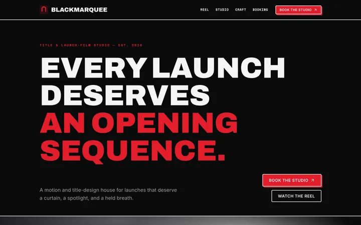
Dramatic
toneHigh-contrast, cinematic interfaces where oversized type and deep shadow turn every screen into a statement.
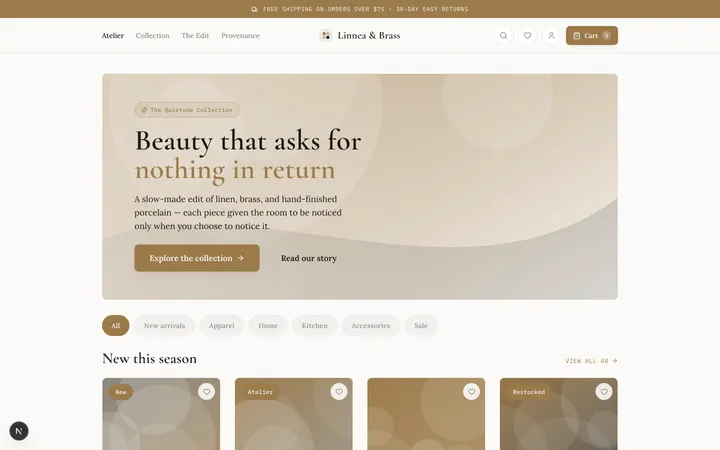
Elegant
toneA refined, airy aesthetic built on generous whitespace, delicate serif type, and whisper-quiet transitions.
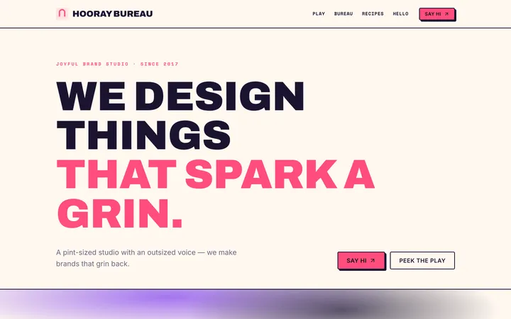
Expressive
toneA bold, personality-forward look that mixes punchy color, playful type, and chunky shapes to make interfaces feel alive.
Corporate
toneA structured, trustworthy interface built on clean grids, restrained blues, and disciplined typography for professional products.
Gradient
aestheticA vibrant, modern look where smooth color blends create depth, energy, and focus without visual clutter.
Contemporary
toneClean structure meets current taste—crisp type, balanced whitespace, and quiet accents for an interface that feels effortlessly modern.
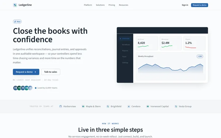
Application
layoutA developer-first app shell with top-bar navigation, card-based panels, and dense, no-nonsense workflows built for getting things done.
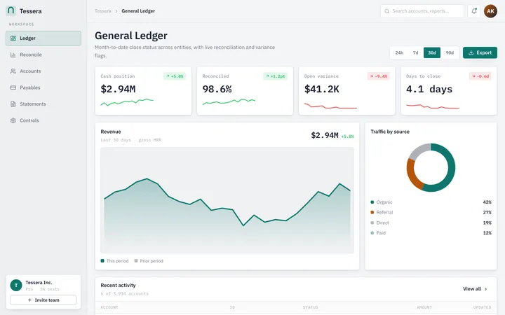
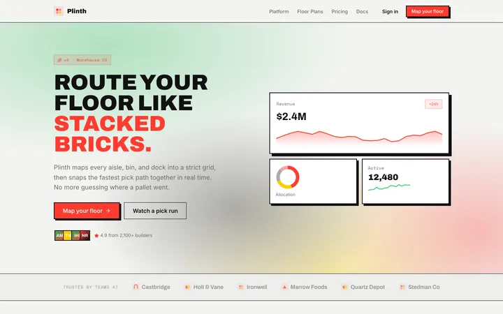
Ledger
aestheticAn enterprise-grade system tuned for data-dense screens—structured grids, precise tabular type, and quiet color that keeps thousands of rows readable.
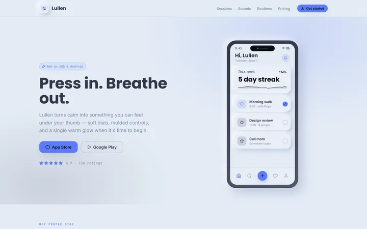
Claymorphism
aestheticSoft, puffy surfaces molded from light and shadow—rounded, tactile, and playful, like pressing buttons made of pastel clay.
Brutalism
aestheticRaw, loud, and unapologetic—hard edges, heavy borders, stark contrast, and type that shouts, with zero decoration to hide behind.
Dithered
retroPatterned pixel-grit and controlled noise give clean layouts a tactile, retro-machine character without sacrificing legibility.
Mono
themedA single typewriter typeface, tight grids, and deliberate restraint turn plain text into a confident, system-like interface.
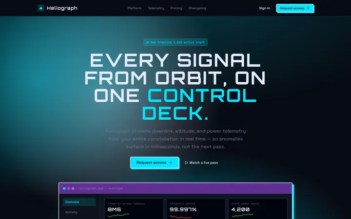
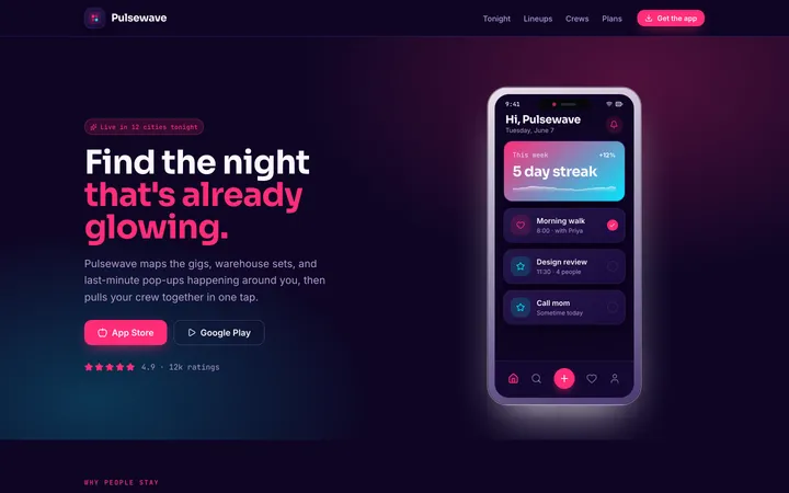
Futuristic
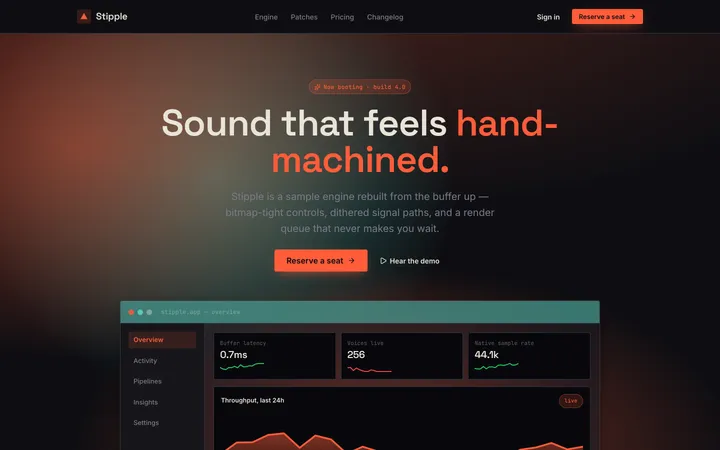
themedSleek dark surfaces, glowing accents, and precise sci-fi panels make every screen feel like the control deck of something advanced.
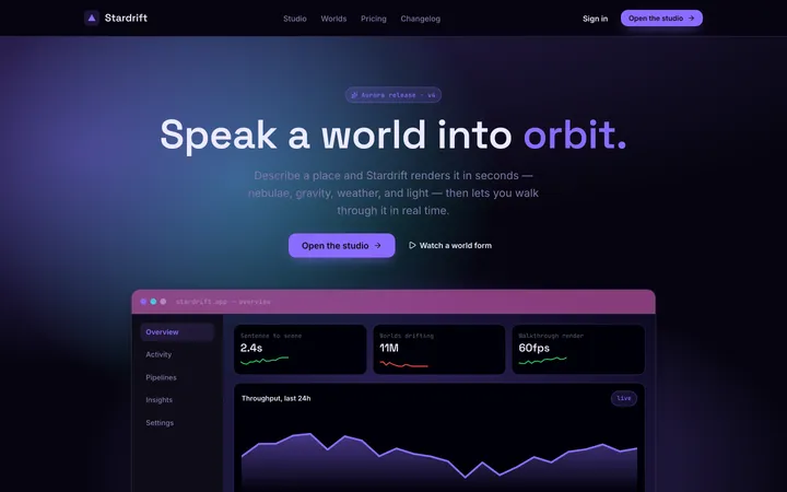
Cosmic
themedDeep-space gradients, luminous nebula accents, and layered glass depth create an immersive interface that feels genuinely otherworldly.
Publication
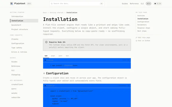
editorialEditorial typography, structured grids, and measured spacing put the words first for clear, confident long-form reading.
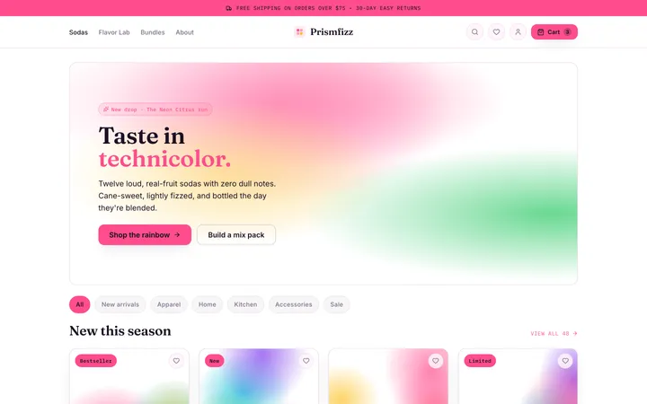
Colorful
toneA high-energy, saturation-forward system that turns bold hue contrasts and joyful gradients into interfaces that feel alive and unmistakably expressive.
Modern
toneA clean, contemporary system of soft shadows, rounded corners, and calm neutral surfaces that makes interfaces feel effortless and current.
Primitive
aestheticAn unstyled-first, utility-driven foundation of accessible, composable building blocks you can theme into anything without fighting opinionated defaults.
Retro
retroA nostalgic system of pixel edges, chunky borders, and warm vintage palettes that recaptures the charm of the early personal-computing web.
Creative
toneA boundary-breaking system of asymmetric layouts, expressive type, and surprising interactions for interfaces that feel like art directed experiences.
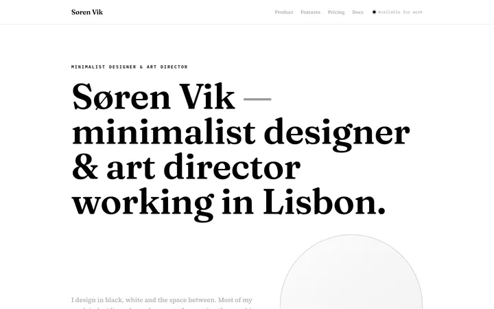
Simple
toneA pared-back interface language that strips away everything but the essentials so the next action is always obvious.
Spacious
toneAn airy layout language where generous whitespace and slow rhythm make every screen feel calm, premium, and effortless to read.
Fantasy
themedAn immersive, mystical interface language of ornate borders, candlelit golds, and arcane glow that turns a screen into an enchanted artifact.
Storytelling
editorialAn editorial layout language that paces content like a narrative, using imagery, rhythm, and hierarchy to pull the reader from scene to scene.
Skeumorphism
aestheticA tactile interface language that mimics real-world materials with rich texture, layered depth, and physical shadows so digital elements feel touchable.
Sleek
toneA streamlined, high-gloss interface language with razor-sharp type, near-zero clutter, and a fast, premium rhythm.
Material
aestheticA tactile, layered interface system where elevated surfaces, purposeful motion, and clear hierarchy make every action feel physical and obvious.
Minimal
toneA stripped-down system that removes every ounce of noise so content and core function are all that remain.
Friendly
toneA warm, approachable system built from soft shapes, rounded edges, and inviting color that makes every interaction feel welcoming.
Vibrant
toneA high-energy system of bold colors, electric gradients, and lively motion that makes interfaces feel alive and exciting.
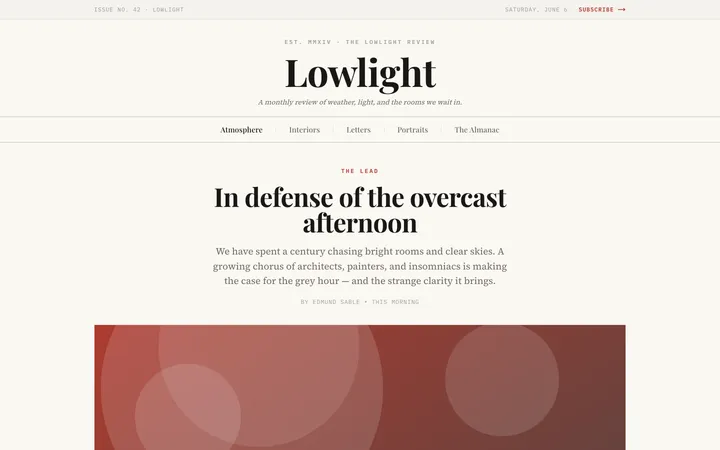
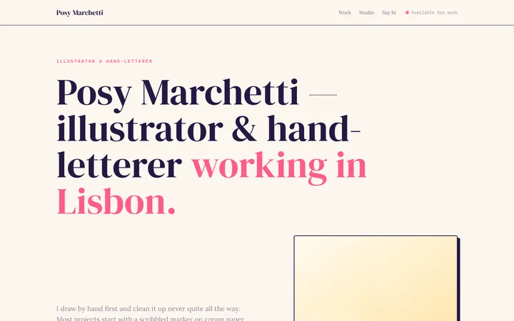
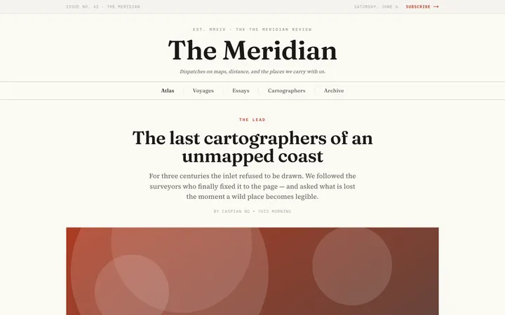
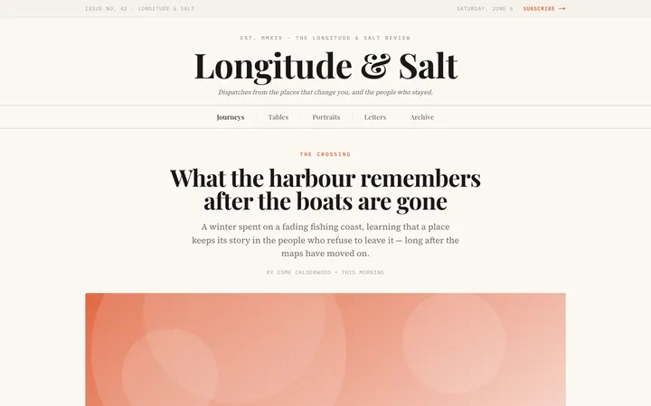
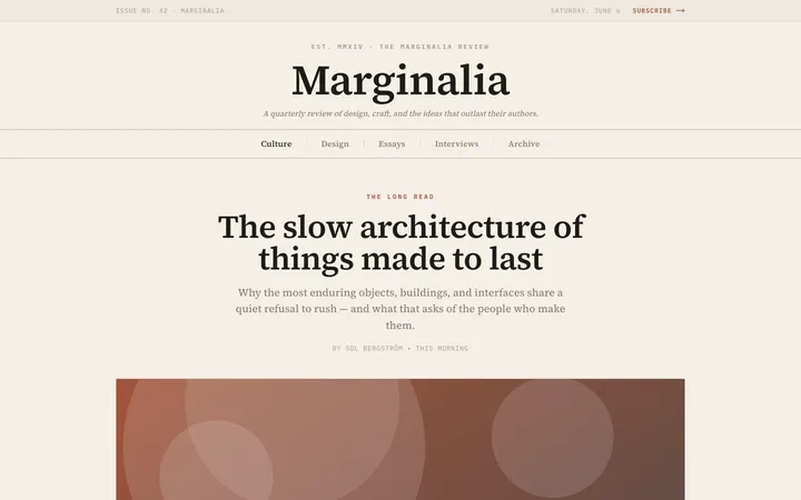
Editorial
editorialA magazine-grade design system that makes typography the hero, pairing structured grids with generous whitespace and confident headlines.
Neon
themedA dark-mode-first system built on glowing borders, fluorescent accents, and high-contrast cyberpunk energy.
Hatch
aestheticA ship-fast indie-hacker aesthetic — bold, practical, metric-forward UI with zero fluff and a make-it-work attitude.
Flat
aestheticA crisp, minimalist system of solid colors and simple shapes with no depth tricks — pure clarity and effortless readability.
Vintage
retroA nostalgic system of classic typography, muted earthy palettes, and timeworn texture for interfaces with character and warmth.
Bubble
aestheticA playful, minimal interface where bright candy colors, pillowy rounded shapes, and tactile 3D borders make every element feel pressable and friendly.
Blocks
layoutA modular, grid-locked system of interlocking geometric panels in vibrant, high-contrast colors that snap together like a precise toy construction set.
Vellum
editorialA restrained editorial style with warm ivory surfaces, near-black slate ink, sharp contrast, and sparse clay accents for an authoritative, deeply readable interface.
Manifest
editorialA radically minimal blank-canvas style with edge-to-edge white space, black-only UI, pill interactions, zero shadows or gradients, and typography-led hierarchy.
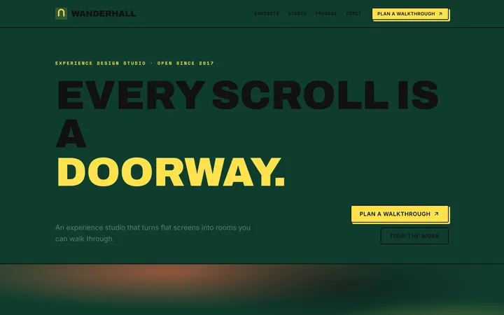
Immersive
themedA playful digital-exhibit style with a continuous deep-green canvas, bold white cards, thick black borders, offset shadows, skewed buttons, and gamified motion-driven storytelling.
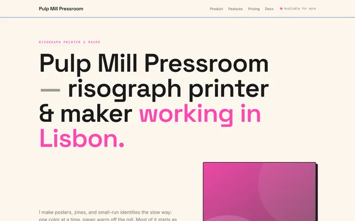
Riso
retroA joyful two-color print look with warm paper, fluorescent-pink interactions, federal-blue headlines, and playful offset shadows that feel hand-cranked off a duplicator.
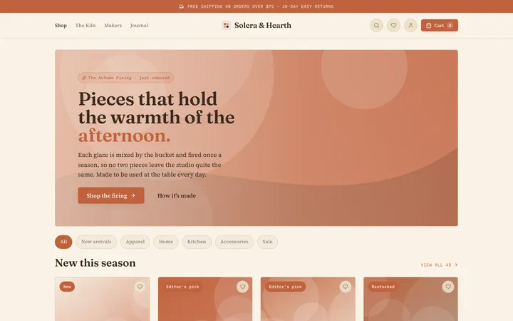
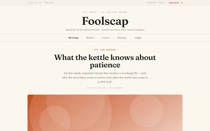
Terracotta
editorialA sun-baked editorial style with warm cream surfaces, ink-brown serif headlines, and a single clay accent built for long, comfortable reading.
Sketch
editorialA friendly hand-drawn style with warm cream paper, soft teal accents, handwritten headings, pill controls, dashed outlines, and pencil-like offset shadows.
Impeccable
editorialA warm graphic-poster editorial style with cream and burnt-orange sections, amber accents, high contrast, and confident modern typography that commands attention.
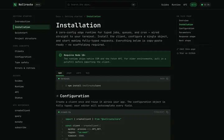
Terminal
themedA cyber-slick dark interface with monospaced type, hairline borders, dense data surfaces, sharp corners, and a single electric-green accent.
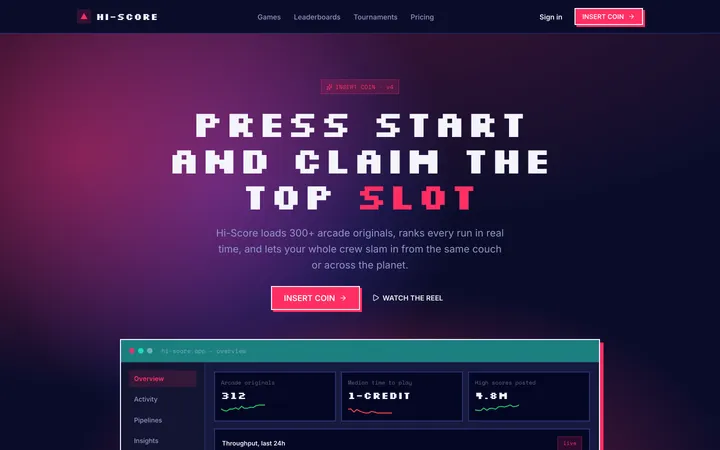
Arcade
retroA coin-op cabinet aesthetic with pixel type, hard square corners, chunky pressable pills, and stacked rainbow shadows that beg to be smashed.
Fiction
editorialA storybook style with warm cream pages, bold rounded type, saturated color blocks, thick inky outlines, and friendly hand-drawn shapes.