Spacious
Opens layouts with air and clear separation so content reads effortlessly.
- Version
- v1.0.0 · Updated Jul 18, 2026
- Context
- ≈1,303 tokens
- Security
- ✓ scanned
- License
- Single seat
- Works with
- Claude Code, Cursor, Codex
Checkout opens soon · launches at $9
≈1,303 tokens · v1.0.0
Live demo — an original page built in the Spacious style. Open in new tab
About this skill
Spacious design emphasizes generous whitespace, airy layouts, and clear visual separation, making content feel calm, readable, and effortlessly organized. Its live demo renders a SaaS landing page — hero, bento feature grid, stats band, pricing, and testimonials.
The skill file
Spacious treats empty space as a feature, not waste. By giving every element room to breathe, the interface slows the eye, lowers cognitive load, and reads as calm and quietly expensive. It is the opposite of dense — content is grouped clearly, separated obviously, and never made to fight for attention. Reach for Spacious when you want a premium, unhurried feeling: brand pages, reading experiences, and products where serenity signals quality.
Design principles
- Whitespace is the primary material; aim for more negative space than you think is needed.
- Let air, not lines, separate sections — rely on margin before you reach for a border.
- Limit the elements on any one screen so each has space to stand alone.
- Use large, light-weight type to create a slow, gentle rhythm.
- Keep one accent and use it as a single point of focus per view.
- Prefer one idea per section and let the page scroll, rather than packing it tight.
Color
The palette is soft and low-contrast by design, so nothing feels loud. The background is a warm near-white (#FCFCFD) with pure white (#FFFFFF) surfaces that lift content through light shadow rather than borders. Text is a soft ink (#1C1E26) rather than harsh black, keeping the page gentle. Muted slate (#8A8F9C) carries secondary copy, and borders, when used at all, are a whisper-thin #ECEEF3. The single accent is a calm periwinkle-indigo (#5B6CFF), applied to one button or link per section. In dark mode, shift the canvas to a deep desaturated navy-charcoal (#15171E), surfaces to #1E212B, foreground to #E8E9EE, muted to #9AA0AE, and keep the indigo accent at #7C8BFF so it glows softly against the dark field.
Typography
Type is large, light, and confident. Headings use Sora (or Inter) at weights 300–400, sized generously and tracked tight at -0.02em so big text stays elegant rather than shouty. Body copy is Inter at 400, set at a comfortable 17–18px with a notably open 1.7 line-height that reinforces the airy mood. The scale steps in a wide major third (roughly 16 / 20 / 25 / 31 / 39 / 49px), with plenty of jump between levels so hierarchy is unmistakable. Paragraph measure is kept narrow (around 60–70 characters) so reading stays restful.
- Layout & spacing
- Components
- Motion
- Accessibility
- Use it with your AI tool
Preview ends here
Layout & spacing, Components, Motion, Accessibility & Use it with your AI tool unlock when checkout opens. Get notified
What's inside
- SKILL.md5.2 KB
More in Design
View allEditorial Pack
Collects the editorial cluster — typography-led, content-first pages in one install.
Design Systems Pack
Bundles every aesthetic design system in one install — switch styles per project.
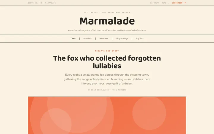
Fiction
Illustrates children's-book warmth with bold outlines and saturated color.

Arcade
Presses chunky pixel buttons and rainbow shadows into arcade-cabinet fun.
More from @staqd
View profileEditorial Pack
Collects the editorial cluster — typography-led, content-first pages in one install.
Design Systems Pack
Bundles every aesthetic design system in one install — switch styles per project.
Fiction
Illustrates children's-book warmth with bold outlines and saturated color.
Arcade
Presses chunky pixel buttons and rainbow shadows into arcade-cabinet fun.