Live demo — an original page built in the Glassmorphism style. Open in new tab
Glassmorphism
Translucent frosted panels that float over colorful depth, blurring the layer beneath into soft luminous glass.
Install via CLI
$ npx staqd add glassmorphismThe skill file
Glassmorphism builds an interface out of frosted panes suspended over color and light. Surfaces are translucent, the layer behind them blurs into soft bloom, and a faint white edge catches the light like the rim of real glass. The result feels modern, airy, and premium — depth without weight. Reach for it when you want a product to feel luminous and tactile, especially over photography, gradients, or rich brand color. Done well, it gives even a simple dashboard the sense of looking through layered, polished glass.
Design principles
- Translucency over opacity: surfaces let a blurred version of what's behind them show through.
- Always pair glass with a colorful or textured backdrop — glass over flat gray has nothing to refract.
- Light defines edges: a thin bright border and inset highlight sell the "glass" illusion.
- Layer with intent — stack panels so blur and shadow imply real distance between them.
- Keep type and icons high-contrast and solid so they stay legible over the busy backdrop.
- Use soft, generous radii; sharp corners break the liquid-glass feeling.
- Treat blur as a material with thickness — heavier blur means a thicker, more frosted pane.
Color
The foundation is a deep #0B1020 night background, ideally carrying a multi-stop gradient and a couple of soft glowing orbs in #7C5CFF (violet) and #22D3EE (cyan), with #F472B6 (pink) for warmth. Surfaces are not solid colors but translucent white rgba(255,255,255,0.08) with backdrop-filter: blur(20px). Borders are luminous hairlines at rgba(255,255,255,0.18). Foreground text is near-white #F8FAFF; muted text steps down to #A6B0D0. The primary action is violet #7C5CFF, often rendered as a violet-to-cyan gradient.
The colorful backdrop is not decoration — it is the engine of the whole style. Without something vivid behind the glass, the blur has nothing to sample and the panels collapse into flat gray boxes. Position your accent orbs deliberately behind key surfaces so the frosted panels pick up a gentle wash of color at their edges. Keep saturated color in the background and let the glass itself stay neutral and translucent, so the interface reads as clean glass tinted by the light behind it rather than as colored plastic.
For a light variant, swap the backdrop to a pale #F8FAFF gradient and switch surfaces to rgba(255,255,255,0.55) with darker #1A1F33 text — keep the blur and the bright border. Light-mode glass needs a slightly higher surface opacity to maintain text contrast, and the glow orbs should be softened so they tint rather than overwhelm.
Typography
Headings use a geometric, slightly futuristic sans (Sora) at 600-700 with -0.01em tracking for a clean, technical feel. Body copy uses Inter at 400 with a roomy 1.6 line-height so text stays readable over the visual noise of blurred color beneath it. Mono (JetBrains Mono) suits metrics, code, and timestamps.
The 1.25 scale keeps hierarchy gentle and elegant rather than shouty, which suits the calm, premium mood. Always render text at full opacity — never make text itself translucent, since that is the fastest way to lose legibility against a moving color backdrop. Add a faint text shadow only where copy must sit over a bright region; otherwise keep glyphs crisp and let the frosted surface provide the separation.
Layout & spacing
Use an 8px grid with airy 24-32px padding inside glass panels so the blur has room to breathe. Containers cap around 1140px. Compose in visible layers: a colorful base, a primary glass surface, and smaller floating glass chips on top, each separated by shadow. Negative space is essential — overcrowding kills the floating effect.
Keep one or two glowing accent orbs positioned behind key panels to give the blur something beautiful to sample. Stack elements at distinct elevations: the further a panel floats from the background, the larger its shadow and the brighter its top highlight. This deliberate layering is what turns a flat screen into something that feels three-dimensional and lit from within.
Components
- Buttons: primary uses a gradient fill (violet to cyan) with a soft outer halo; secondary buttons are glass with a bright border and brighten on hover.
- Inputs: translucent fields with a subtle inset highlight; focus brightens the border and adds a faint accent glow ring.
- Cards: frosted
rgba(255,255,255,0.08)panels, 16px radius, hairline border, layered soft shadow plus inset top highlight. - Navigation: a frosted bar that blurs content scrolling beneath it; active items get a glass pill background with a faint glow.
- Modals/overlays: a stronger-blur glass panel over a dimmed, heavily blurred backdrop so focus snaps to the dialog.
- Tables: transparent rows with hairline dividers; header row slightly more opaque for separation, hover row brightens subtly.
- Badges/tags: small glass pills with colored text and a faint matching glow.
- Charts: glowing line and area fills in accent colors that read clearly against the dark glass, with soft gradient fills under lines.
- Tooltips: tiny ultra-frosted chips that float just above their trigger with a crisp white edge.
Motion
Motion is fluid and weightless. Transitions run 200-300ms on an ease-out or gentle spring curve. Panels fade-and-rise into view; hover states lift a card 2-4px and intensify its glow and border brightness. Background orbs drift slowly and continuously, giving the glass a living surface to refract.
Avoid hard or instant changes — everything should feel like it is floating in liquid. Blur intensity can subtly increase on the backdrop when a modal opens, pushing the underlying content further away and pulling focus to the foreground glass. Keep motion smooth and continuous rather than snappy; the style lives or dies on that sense of gentle, frictionless float.
Accessibility
Translucency is the main accessibility risk. Guarantee text meets WCAG 2.2 AA by ensuring a sufficiently dark or blurred region sits directly behind any text — never place body copy over a bright orb. #F8FAFF on the dark glass clears AA comfortably; verify muted #A6B0D0 only for large or secondary text.
Provide a clearly visible :focus-visible ring (a solid 2px accent outline, not just a glow) since glow alone can be hard to perceive, especially for low-vision users. Respect prefers-reduced-motion by freezing the drifting orbs and removing lift animations. Offer a "reduce transparency" fallback that swaps glass for solid #161B2E surfaces for users who need maximum contrast, and ensure interactive controls have a non-translucent state so they remain perceivable when the backdrop happens to align with their color.
Use it with your AI tool
Paste this skill into your AI coding tool (Claude, Cursor, Codex), then prompt for the component you need. Install: npx staqd add glassmorphism
Use it with these prompts
Glass card
FreeBuild a frosted glass card in the Glassmorphism style: a translucent white panel with backdrop blur, a thin luminous white border, 16px rounded corners, and a soft drop shadow, floating over a deep blue-violet gradient background with two glowing color orbs behind it.
Login screen
ProAnalytics dashboard
ProMore aesthetic skills
Neumorphism
aestheticA soft, extruded interface where elements appear to push out of or press into a single continuous surface using paired light and dark shadows.
Artistic
aestheticAn expressive, hand-made design system blending organic blobs, playful illustration, and unconventional layouts into interfaces that feel like a living sketchbook.
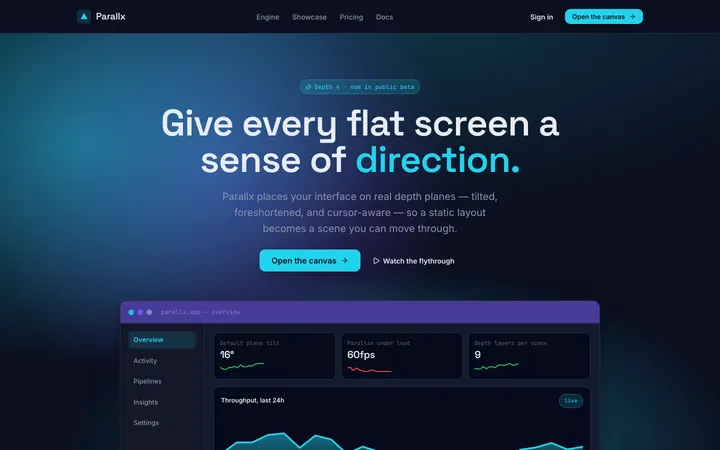
Perspective
aestheticA spatial design system that uses angled planes, layered depth, and foreshortening to give flat screens a dynamic, three-dimensional sense of direction.