Material
Stacks layered surfaces with meaningful motion and clear hierarchy.
- Version
- v1.0.0 · Updated Jul 18, 2026
- Context
- ≈1,271 tokens
- Security
- ✓ scanned
- License
- Single seat
- Works with
- Claude Code, Cursor, Codex
Checkout opens soon · launches at $9
≈1,271 tokens · v1.0.0
Live demo — an original page built in the Material style. Open in new tab
About this skill
Material style is a clean, tactile design system with layered surfaces, meaningful motion, and clear hierarchy—balancing usability, consistency, and visual warmth. Its live demo renders an analytics dashboard — KPI tiles, revenue charts, and a data table.
The skill file
Material is an interface system built on the idea that digital surfaces should behave like thin sheets of a real material: they cast shadows, stack in layers, and respond to touch. The result is an experience that feels tactile, predictable, and warm without being loud. Reach for Material when you want a polished, cross-platform app feel where hierarchy and feedback matter more than visual flash.
Design principles
- Surfaces are physical. Each panel is a sheet with a real elevation, and shadows communicate which layer the user is on.
- Motion has meaning. Transitions explain where things come from and where they go, never decorating for its own sake.
- One bold accent drives action. #2962FF marks the primary path and #00BFA5 supports secondary success states.
- Hierarchy through type roles. A fixed set of text styles keeps every screen consistent and legible.
- Generous touch targets. Everything tappable is comfortable for a thumb.
- Consistency over novelty. The same component behaves the same way everywhere in the product.
Color
The app sits on a light #F2F4F8 background so that white #FFFFFF surfaces visibly lift away from it. Primary actions, links, and active states use #2962FF, a confident blue that signals interactivity. #00BFA5 acts as a complementary accent for confirmations, progress, and positive feedback. Foreground text is near-black #1A1C20 for headings and primary copy, with #5F6571 for secondary labels and metadata. Borders and dividers stay soft at #E1E5EC. For dark mode, drop the background to #121417, raise surfaces to #1E2126, keep #2962FF (lightened to #5B8DFF if contrast requires), and shift foreground to #ECEEF2. Elevation in dark mode reads through lighter surface tints rather than heavy shadows.
Typography
Roboto carries the entire system for a clean, neutral, highly legible voice. Headings use 500 weight at 0 tracking, body uses 400 weight at a hair of positive tracking (0.01em), and captions drop to 12px with #5F6571. A defined set of roles, from a large display style down to caption and overline, ensures every screen pulls from the same scale. Line-height holds at 1.5 for body to keep dense lists and forms readable. Roboto Mono handles code, IDs, and any tabular data.
- Layout & spacing
- Components
- Motion
- Accessibility
- Use it with your AI tool
Preview ends here
Layout & spacing, Components, Motion, Accessibility & Use it with your AI tool unlock when checkout opens. Get notified
What's inside
- SKILL.md5.1 KB
More in Design
View allEditorial Pack
Collects the editorial cluster — typography-led, content-first pages in one install.
Design Systems Pack
Bundles every aesthetic design system in one install — switch styles per project.
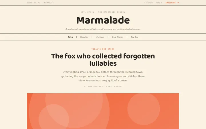
Fiction
Illustrates children's-book warmth with bold outlines and saturated color.

Arcade
Presses chunky pixel buttons and rainbow shadows into arcade-cabinet fun.
More from @staqd
View profileEditorial Pack
Collects the editorial cluster — typography-led, content-first pages in one install.
Design Systems Pack
Bundles every aesthetic design system in one install — switch styles per project.
Fiction
Illustrates children's-book warmth with bold outlines and saturated color.
Arcade
Presses chunky pixel buttons and rainbow shadows into arcade-cabinet fun.