Professional
Projects competence with tidy, corporate-ready layouts that earn trust.
- Version
- v1.0.0 · Updated Jul 18, 2026
- Context
- ≈1,208 tokens
- Security
- ✓ scanned
- License
- Single seat
- Works with
- Claude Code, Cursor, Codex
Checkout opens soon · launches at $9
≈1,208 tokens · v1.0.0
Live demo — an original page built in the Professional style. Open in new tab
About this skill
A clean, trustworthy, and corporate-ready design system optimized for business applications and productivity tools. Its live demo renders a SaaS marketing landing page — hero, onboarding steps, pricing table, FAQ, and testimonials.
The skill file
Professional is the dependable, credible look that business buyers trust on sight. It is clean and calm, with measured whitespace, a restrained palette, and confident typography that signals competence without shouting. Reach for it when the product needs to feel safe to adopt — productivity tools, client portals, and any SaaS where credibility drives the sale.
Design principles
- Earn trust through calm. Restrained color, soft shadows, and balanced spacing communicate reliability.
- Clear hierarchy, gentle contrast. Strong enough to guide, soft enough to feel approachable.
- Breathing room over density. Generous whitespace makes complex tools feel manageable.
- Consistency as a feature. Repeatable layouts and components reduce friction for repeat users.
- Purposeful color. Blue carries primary intent; status colors stay reserved and meaningful.
- Polished defaults. Every state — empty, loading, error, success — is considered and tidy.
Color
The background is a barely-there cool white (#FBFCFD) with pure white (#FFFFFF) surfaces that lift content cleanly. Foreground and secondary tones use a soft charcoal-slate (#1B2733) that reads professional without the harshness of pure black. The muted blue primary (#2563A8) is confident but understated, ideal for primary actions, links, and highlights. Muted slate (#5B6B7B) handles supporting copy, and a light #E3E8EE defines borders. Status colors stay calm: green #0E9F6E, amber #D08700, red #D14343. For dark mode, shift to a #10161D background, #1A222C surfaces, #E7ECF1 foreground, #9BA9B7 muted, and a lifted blue #5A93D4 accent for clear contrast.
Typography
Source Sans 3 carries both headings and body for a cohesive, businesslike but warm voice. Headings sit at 600 weight with neutral tracking; body runs at 16px with a comfortable 1.6 line-height that keeps long documents and forms readable. Labels and metadata use 13px with a hint of positive tracking. Source Code Pro handles any codes, IDs, or numeric callouts. The balanced 1.2 scale gives enough contrast between levels to guide the eye while keeping the overall feel composed and even.
- Layout & spacing
- Components
- Motion
- Accessibility
- Use it with your AI tool
Preview ends here
Layout & spacing, Components, Motion, Accessibility & Use it with your AI tool unlock when checkout opens. Get notified
What's inside
- SKILL.md4.8 KB
More in Design
View allEditorial Pack
Collects the editorial cluster — typography-led, content-first pages in one install.
Design Systems Pack
Bundles every aesthetic design system in one install — switch styles per project.
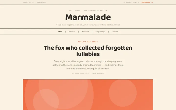
Fiction
Illustrates children's-book warmth with bold outlines and saturated color.

Arcade
Presses chunky pixel buttons and rainbow shadows into arcade-cabinet fun.
More from @staqd
View profileEditorial Pack
Collects the editorial cluster — typography-led, content-first pages in one install.
Design Systems Pack
Bundles every aesthetic design system in one install — switch styles per project.
Fiction
Illustrates children's-book warmth with bold outlines and saturated color.
Arcade
Presses chunky pixel buttons and rainbow shadows into arcade-cabinet fun.