Sleek
Streamlines interfaces to sharp type and smooth rhythm for a fast, premium feel.
- Version
- v1.0.0 · Updated Jul 18, 2026
- Context
- ≈1,176 tokens
- Security
- ✓ scanned
- License
- Single seat
- Works with
- Claude Code, Cursor, Codex
Checkout opens soon · launches at $9
≈1,176 tokens · v1.0.0
Live demo — an original page built in the Sleek style. Open in new tab
About this skill
Sleek design is streamlined and polished, with sharp typography, minimal clutter, and smooth visual rhythm that gives interfaces a fast, premium feel. Its live demo renders a product launch landing page — centered hero, feature showcase, pricing, and FAQ.
The skill file
Sleek is the language of high-end software that wants to feel fast before a single pixel moves. It leans on deep, near-black canvases, a single confident violet accent, and typography so tight it reads as engineered rather than written. Reach for Sleek when the product is premium, data-dense, or aspirational, and the brand promise is speed and polish.
Design principles
- Subtract relentlessly: every element must earn its place, and decoration is treated as debt.
- One accent, used sparingly. The violet (#6C5CE7) signals action and nothing else competes with it.
- Sharpness over softness: tight tracking, hairline borders, and precise alignment communicate craft.
- Depth through light, not lines. Surfaces lift with ambient glow and inset highlights rather than heavy outlines.
- Rhythm is sacred. Consistent vertical spacing creates a calm, scannable cadence.
- Default to dark. Sleek is born in low light and only adapts to a bright theme when the context demands it.
Color
The core canvas is #0B0B0F, a blue-leaning black that reads richer than pure #000000. Cards and panels sit on #16161D, separated from the background by a single hairline #26262F border rather than a hard shadow. Primary actions use #6C5CE7, with #A29BFE reserved for hover, secondary emphasis, and gradient sweeps. Body text is #F4F4F6 for high legibility, while #8A8A99 carries muted labels, captions, and metadata. For a light variant, invert to a #F7F7FA background with #FFFFFF surfaces, keep #6C5CE7 as the accent, and shift foreground to #16161D. Gradients should stay subtle: a 135-degree blend from #6C5CE7 to #A29BFE for emphasis bars and chart fills only.
Typography
Headings use Inter Tight with a compressed feel, set at weights 600 to 700 and negative tracking around -0.02em so display lines feel locked together. Body copy is Inter at 400 to 500 weight, -0.005em tracking, and a 1.5 line-height for comfortable reading. The type scale is a tight 1.2x modular progression, which keeps hierarchy clear without dramatic jumps. Numerals and code use JetBrains Mono with tabular figures so tables and metrics align perfectly. Avoid italics; emphasis comes from weight and color, not slant.
- Layout & spacing
- Components
- Motion
- Accessibility
- Use it with your AI tool
Preview ends here
Layout & spacing, Components, Motion, Accessibility & Use it with your AI tool unlock when checkout opens. Get notified
What's inside
- SKILL.md4.7 KB
More in Design
View allEditorial Pack
Collects the editorial cluster — typography-led, content-first pages in one install.
Design Systems Pack
Bundles every aesthetic design system in one install — switch styles per project.
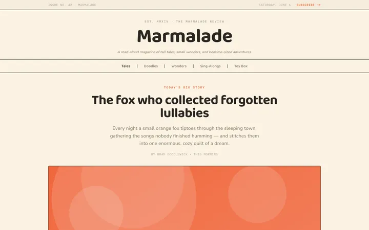
Fiction
Illustrates children's-book warmth with bold outlines and saturated color.

Arcade
Presses chunky pixel buttons and rainbow shadows into arcade-cabinet fun.
More from @staqd
View profileEditorial Pack
Collects the editorial cluster — typography-led, content-first pages in one install.
Design Systems Pack
Bundles every aesthetic design system in one install — switch styles per project.
Fiction
Illustrates children's-book warmth with bold outlines and saturated color.
Arcade
Presses chunky pixel buttons and rainbow shadows into arcade-cabinet fun.