Neon
Electrifies dark UIs with glowing borders and fluorescent cyberpunk color.
- Version
- v1.0.0 · Updated Jul 18, 2026
- Context
- ≈1,327 tokens
- Security
- ✓ scanned
- Works with
- Claude Code, Cursor, Codex
Install via CLI
$ npx staqd add neon≈1,327 tokens · v1.0.0
Live demo — an original page built in the Neon style. Open in new tab
About this skill
A dark-mode optimized design system featuring glowing borders, high-contrast fluorescent colors, and cyberpunk aesthetics. Its live demo renders an analytics dashboard — KPI tiles, revenue charts, and a data table.
The skill file
Neon
Neon is a dark-mode-first system that turns interfaces into glowing circuitry. Surfaces sit in near-black, and energy comes from luminous cyan and magenta edges, gradient text, and soft colored bloom.
It feels electric, nocturnal, and high-stakes. Reach for Neon when you want an interface to feel like a control panel from a brighter, faster future — gaming and esports, crypto and web3, music and nightlife, and anything that thrives after dark.
Design principles
- Dark always wins. The canvas is near-black; light is something you emit, never a background.
- Glow over shadow. Depth comes from colored box-shadow bloom, not gray drop shadows.
- Two charged accents. Cyan and magenta carry the system; purple bridges them in gradients.
- Restrained luminance. Glow is a spice — apply it to focal elements so everything doesn't scream.
- Technical typography. Mono numerals and tracked-out uppercase labels evoke a HUD.
- Texture sparingly. Faint grids and scanlines add atmosphere without noise.
Color
The base is a deep blue-black (#0A0A12) with surfaces lifting to #13131F and elevated panels to #1A1A2E. Text is a cool near-white (#E8E8FF) with muted lavender-gray (#8B8BA7) for secondary copy.
- Primary accent: electric cyan (
#00E5FF) — main actions, focus, key data. - Secondary accent: hot magenta (
#FF2E97) — highlights, featured states, destructive actions. - Bridge: purple (
#A855F7) — connects the two in gradients and glows. - Borders: a low-contrast
#26263Aby default, switching to a glowing accent on hover or focus.
Because the system is dark-native, "light mode" is intentionally not the home. If a light variant is required, use a charcoal #16161F rather than white, keeping the neon accents intact. Reserve pure saturated glow for interactive and focal elements only — let the near-black field do the resting.
Typography
Headings use a geometric, slightly technical sans with tight tracking for a confident, machined look; the most prominent headlines can carry a cyan-to-magenta gradient fill.
- Headlines: technical sans, 32-72px, -0.01em tracking, weight 600-700.
- Body: clean neutral sans, 16-18px, weight 400, for readability on dark.
- Numerals: monospace face — prices, stats, timers — for an instrument-like feel.
- Micro-labels: uppercase, +0.12em tracking, muted color, 11-13px.
Avoid thin weights, which shimmer and fade on dark backgrounds. Keep to regular (400), medium (500), and bold (700).
Layout & spacing
Use a 12-column grid on an 8px base unit with moderate density — dashboards can be information-rich, but each panel keeps internal breathing room. Container widths cap around 1280px.
Group related controls inside bordered panels with 20-24px internal padding. Let the near-black background show through as negative space between panels rather than filling everything. A faint 1px grid or dot texture at very low opacity can underlay the whole canvas for atmosphere.
Components
- Buttons: primary is a dark fill with a cyan outline and glow; hover intensifies the bloom and brightens the label. Destructive uses magenta glow.
- Inputs: dark surface, 1px
#26263Aborder, with the border and a soft cyan glow appearing on focus. - Cards:
#13131Fsurface, 8px radius, thin border that lights up on hover; featured cards get a persistent accent glow ring. - Navigation: a dark top bar or sidebar with an underline or left-bar glow marking the active item.
- Modals & overlays: centered dark panels with an accent-glow border over a heavily darkened, slightly blurred backdrop.
- Tables: dark rows separated by faint borders, mono numerals, and accent-colored status text instead of filled badges.
- Badges: pill outlines in cyan or magenta with a faint matching glow and uppercase tracked labels.
- Icons: line icons that carry a subtle glow when active or selected.
Motion
Motion is energetic but controlled — synthetic, not organic.
- Glows pulse gently on key metrics (a 2-3s ease-in-out loop at low amplitude).
- Hover states ramp glow intensity over 150ms ease-out; presses snap inward slightly (scale 0.98).
- Gradient text and borders can slowly drift their hue.
- Page transitions use quick 250ms fades with a faint upward slide.
Keep motion crisp — no soft bounce.
Accessibility
- Cool near-white text (
#E8E8FF) on the base (#0A0A12) exceeds 15:1 contrast. - Ensure accent-on-dark text and icons clear 4.5:1 — cyan and magenta both pass at these saturations on the near-black base.
- Never rely on glow alone to signal state; pair it with a border, icon, or label change.
- Focus states use a visible 2px accent ring plus glow, always present and never suppressed.
- Honor
prefers-reduced-motionby disabling pulsing glows and gradient drift, leaving static accents. - Keep glow bloom subtle enough not to reduce text contrast, and ensure interactive targets meet 44x44px.
Meets WCAG 2.2 AA.
Use it with your AI tool
Paste this skill into your AI coding tool (Claude, Cursor, Codex), then prompt for the component you need. Install: npx staqd add neon
What's inside
- SKILL.md5.3 KB
More in Design
View allEditorial Pack
Collects the editorial cluster — typography-led, content-first pages in one install.
Design Systems Pack
Bundles every aesthetic design system in one install — switch styles per project.
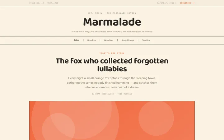
Fiction
Illustrates children's-book warmth with bold outlines and saturated color.

Arcade
Presses chunky pixel buttons and rainbow shadows into arcade-cabinet fun.
More from @staqd
View profileEditorial Pack
Collects the editorial cluster — typography-led, content-first pages in one install.
Design Systems Pack
Bundles every aesthetic design system in one install — switch styles per project.
Fiction
Illustrates children's-book warmth with bold outlines and saturated color.
Arcade
Presses chunky pixel buttons and rainbow shadows into arcade-cabinet fun.