Premium
Signals high-end polish with refined type and restrained, exclusive detail.
- Version
- v1.0.0 · Updated Jul 18, 2026
- Context
- ≈1,272 tokens
- Security
- ✓ scanned
- License
- Single seat
- Works with
- Claude Code, Cursor, Codex
Checkout opens soon · launches at $9
≈1,272 tokens · v1.0.0
Live demo — an original page built in the Premium style. Open in new tab
About this skill
A high-end, sophisticated design system focused on exclusivity, refined typography, and subtle interactions. Its live demo renders an e-commerce storefront — collection hero, product cards, lookbook strip, and reviews.
The skill file
Premium is the language of luxury — the feeling of heavy stock paper, a slow door on a well-made car, a name embossed in gold. It pairs deep, near-black surfaces with warm off-white text and a single restrained gold accent, then lets elegant serif headlines and acres of negative space carry the prestige. Nothing rushes, nothing shouts. Reach for Premium when the product is high-ticket, exclusive, or aspirational, and the experience itself needs to communicate worth before a word is read.
Design principles
- Spend space lavishly — generous emptiness is the clearest signal of quality.
- Restrain the palette to dark, warm neutrals plus one metallic accent used sparingly.
- Lead with serif headlines for editorial elegance; keep body copy in a quiet, unobtrusive sans.
- Prefer hairline gold dividers and faint glows over heavy borders or bright fills.
- Slow everything down: motion, reveals, and transitions should feel deliberate.
- Sweat the micro-details — alignment, tracking, and consistency are what read as "expensive."
Color
The foundation is a warm near-black #0E0E11 with raised surfaces in #16161B, giving depth without going to harsh pure black. The accent is a muted, antique gold #C8A24B — never bright brass — used only for key actions, dividers, and emphasis. Foreground text is a warm off-white #F2EFE9 that feels softer and richer than stark white; a secondary cream #E8E4DA supports it. Muted copy steps down to a warm gray #9A968E, and borders are a barely-visible #2A2A31. The gold must stay scarce: a single line, a single button, a single highlight per view. For a light variant, use a warm ivory #F6F3EC canvas, #1C1C22 text, and the same gold — keeping the same hushed, editorial restraint.
Typography
Headings use a high-contrast serif (Playfair Display) at 500-600 with near-neutral tracking, evoking fashion-magazine elegance. Body runs in a clean neutral sans (Inter) at 400 with a luxurious 1.7 line-height for unhurried reading. Eyebrow labels and metadata use tracked-out small caps at +0.12em to feel engraved. Lean on the dramatic 1.414 scale so headlines tower over body text — the contrast between a large serif heading and small, calm sans copy is the heart of the look. Mono (IBM Plex Mono) appears only for fine technical detail.
- Layout & spacing
- Components
- Motion
- Accessibility
- Use it with your AI tool
Preview ends here
Layout & spacing, Components, Motion, Accessibility & Use it with your AI tool unlock when checkout opens. Get notified
What's inside
- SKILL.md5.1 KB
More in Design
View allEditorial Pack
Collects the editorial cluster — typography-led, content-first pages in one install.
Design Systems Pack
Bundles every aesthetic design system in one install — switch styles per project.
Fiction
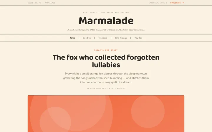
Illustrates children's-book warmth with bold outlines and saturated color.

Arcade
Presses chunky pixel buttons and rainbow shadows into arcade-cabinet fun.
More from @staqd
View profileEditorial Pack
Collects the editorial cluster — typography-led, content-first pages in one install.
Design Systems Pack
Bundles every aesthetic design system in one install — switch styles per project.
Fiction
Illustrates children's-book warmth with bold outlines and saturated color.
Arcade
Presses chunky pixel buttons and rainbow shadows into arcade-cabinet fun.