Luxury
Drapes interfaces in rich texture and metallic accents for an opulent feel.
- Version
- v1.0.0 · Updated Jul 18, 2026
- Context
- ≈1,249 tokens
- Security
- ✓ scanned
- License
- Single seat
- Works with
- Claude Code, Cursor, Codex
Checkout opens soon · launches at $9
≈1,249 tokens · v1.0.0
Live demo — an original page built in the Luxury style. Open in new tab
About this skill
An opulent design system utilizing rich textures, metallic accents, and a refined, exclusive visual language. Its live demo renders an e-commerce storefront — collection hero, product cards, lookbook strip, and reviews.
The skill file
Luxury is restraint turned into prestige. Deep, near-black surfaces, airy serif typography, and sparing strokes of metallic gold create a sense of rarity and craft — the digital equivalent of a heavy embossed card. Reach for it when the brand sells aspiration: premium products, exclusive memberships, and high-end editorial where every pixel should feel deliberate and expensive.
Design principles
- Restraint signals value. Use less, space it generously, and let emptiness feel intentional.
- Metallic accents are precious. Gold appears in thin rules, fine borders, and single highlights — never as a flood.
- Serif elegance. Refined typefaces and airy tracking carry the sense of craft.
- Deep, quiet darkness. Rich near-black surfaces make light, text, and gold feel luminous.
- Hairline detail. Thin dividers and fine borders convey precision over heaviness.
- Slow, graceful motion. Nothing rushes; transitions feel composed and confident.
Color
The base is a deep near-black (#0E0E10) with a slightly lifted charcoal surface (#1A1A1E) for cards and panels, giving depth without ever feeling flat. The metallic gold primary (#C9A24B) is reserved for accents, fine borders, and a single highlighted action per view. A warm ivory secondary (#E8E2D4) and soft cream foreground (#F3EFE6) keep text elegant and readable against the dark. Muted taupe (#9A9385) handles supporting copy, and a quiet #2C2A26 defines hairline borders. A deeper antique gold #7A6A3E serves hover and pressed states. For a light variant, switch to a warm parchment #F6F2E9 background, #FFFFFF surfaces, near-black #1A1A1E foreground, and a richer #A8842F gold so the metallic reads on light fields.
Typography
Cormorant Garamond drives display headings with high contrast and graceful curves, set large and airy at +0.02em tracking. EB Garamond carries body copy at 17px with a relaxed 1.7 line-height for an editorial, unhurried read. IBM Plex Mono provides a tasteful contrast for prices, SKUs, and fine metadata. The dramatic 1.333 perfect-fourth scale gives headlines real presence while body and labels stay refined. Use light-to-regular weights; luxury here is delicacy, not bulk.
- Layout & spacing
- Components
- Motion
- Accessibility
- Use it with your AI tool
Preview ends here
Layout & spacing, Components, Motion, Accessibility & Use it with your AI tool unlock when checkout opens. Get notified
What's inside
- SKILL.md5.0 KB
More in Design
View allEditorial Pack
Collects the editorial cluster — typography-led, content-first pages in one install.
Design Systems Pack
Bundles every aesthetic design system in one install — switch styles per project.
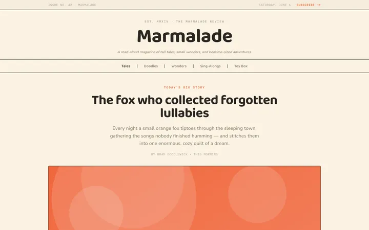
Fiction
Illustrates children's-book warmth with bold outlines and saturated color.

Arcade
Presses chunky pixel buttons and rainbow shadows into arcade-cabinet fun.
More from @staqd
View profileEditorial Pack
Collects the editorial cluster — typography-led, content-first pages in one install.
Design Systems Pack
Bundles every aesthetic design system in one install — switch styles per project.
Fiction
Illustrates children's-book warmth with bold outlines and saturated color.
Arcade
Presses chunky pixel buttons and rainbow shadows into arcade-cabinet fun.