Clean
Strips interfaces to clear structure, crisp type, and generous whitespace.
- Version
- v1.0.0 · Updated Jul 18, 2026
- Context
- ≈1,203 tokens
- Security
- ✓ scanned
- License
- Single seat
- Works with
- Claude Code, Cursor, Codex
Checkout opens soon · launches at $9
≈1,203 tokens · v1.0.0
Live demo — an original page built in the Clean style. Open in new tab
About this skill
Clean design is minimal and distraction-free, using clear structure, ample whitespace, and crisp typography to keep interfaces simple, readable, and focused. Its live demo renders a SaaS marketing landing page — hero, onboarding steps, pricing table, FAQ, and testimonials.
The skill file
Clean is restraint as a feature. It strips an interface down to structure, space, and type, removing every ornament that doesn't help the user. There are no competing accents, no heavy shadows, no decorative flourishes — just a calm white canvas where content is the hero. Reach for Clean when clarity and focus matter most: tools people use all day, documentation they read closely, and products where getting out of the way is the whole point.
Design principles
- Whitespace is the primary design tool — separate things with space before reaching for borders or boxes.
- One typeface, one accent. Hierarchy comes from weight, size, and color, not new fonts or colors.
- Remove everything non-essential; if an element doesn't aid comprehension, cut it.
- Favor hairline dividers and the faintest shadows over heavy containers.
- Keep alignment strict and grids honest — visual quiet depends on order.
- Use the accent color rarely so it always means "this matters."
Color
The canvas is pure #FFFFFF with secondary surfaces in a barely-there #F8FAFB to softly group content without boxing it. The single accent is a confident blue #2D6BFF, reserved for primary actions, links, and active states. Foreground text is a near-black #1A1D21 for crisp reading; muted text and helper copy drop to #6B7280. Borders are a whisper-light #E6E9ED. The discipline is in scarcity: most of the screen is white, text is dark, and blue appears only where action lives. For a dark variant, set the canvas to #0F1115, surfaces to #171A20, text to #ECEEF1, and keep the same blue accent — it reads beautifully against the dark while staying just as restrained.
Typography
Clean commits to a single, highly legible neutral sans (Inter) across the entire system. Headings sit at 600 weight with -0.011em tracking; body runs at 400 with a comfortable 1.6 line-height. The gentle 1.2 scale keeps the jump between sizes subtle, so hierarchy feels orderly rather than dramatic. Mono (IBM Plex Mono) is reserved for code and data. Avoid italics, all-caps headers, and decorative weights — the typography's job is to disappear and let the words read.
- Layout & spacing
- Components
- Motion
- Accessibility
- Use it with your AI tool
Preview ends here
Layout & spacing, Components, Motion, Accessibility & Use it with your AI tool unlock when checkout opens. Get notified
What's inside
- SKILL.md4.8 KB
More in Design
View allEditorial Pack
Collects the editorial cluster — typography-led, content-first pages in one install.
Design Systems Pack
Bundles every aesthetic design system in one install — switch styles per project.
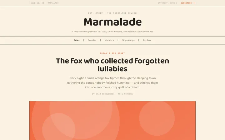
Fiction
Illustrates children's-book warmth with bold outlines and saturated color.

Arcade
Presses chunky pixel buttons and rainbow shadows into arcade-cabinet fun.
More from @staqd
View profileEditorial Pack
Collects the editorial cluster — typography-led, content-first pages in one install.
Design Systems Pack
Bundles every aesthetic design system in one install — switch styles per project.
Fiction
Illustrates children's-book warmth with bold outlines and saturated color.
Arcade
Presses chunky pixel buttons and rainbow shadows into arcade-cabinet fun.