Live demo — an original page built in the Blocks style. Open in new tab
Blocks
A modular, grid-locked system of interlocking geometric panels in vibrant, high-contrast colors that snap together like a precise toy construction set.
Install via CLI
$ npx staqd add blocksInside this skill
Blocks is a modular, grid-first system where the interface reads as a set of interlocking geometric panels snapped onto a strict layout. Every region is a deliberate rectangle of solid color, divided by crisp black rules, with zero rounding and zero blur. The feeling is confident, structured, and energetic, like a precision toy construction set rendered in software. Reach for Blocks when content is dense and varied and you want the layout itself to do the organizing work.
Design principles
- The grid is sacred: every element snaps to a 12-column structure with consistent gutters and no orphaned spacing.
- Color blocks define regions; backgrounds carry meaning rather than decoration.
- Square corners everywhere (0px radius) and hard 2px rules instead of shadows.
- High contrast and saturation create clear visual hierarchy through color weight.
- Modules are self-contained and interchangeable, like physical bricks that can be rearranged.
- Type is condensed and structural, reinforcing the architectural feel.
Blocks is a Pro skill
Unlock the full Blocks spec — design tokens, component coverage, motion, and accessibility — plus the entire library of design skills and Pro prompts.
- Every design skill, growing weekly
- Full Pro prompt library + unlimited MCP
- Commercial-use rights on output
Use it with these prompts
Modular dashboard
FreeBuild an analytics dashboard in the Blocks style: a strict 12-column grid of edge-to-edge colored panels separated by 2px black rules, square corners, condensed uppercase metric labels, and primary-red callout tiles.
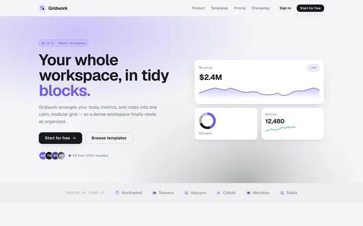
Bento landing grid
ProPricing matrix
ProMore layout skills
Bento
layoutA modular grid of card-like blocks with clear hierarchy and soft spacing that makes any content feel organized, scannable, and modern.
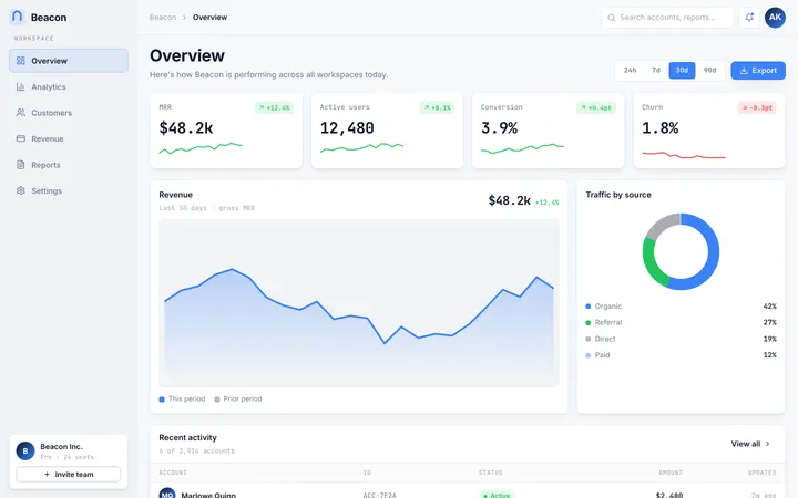
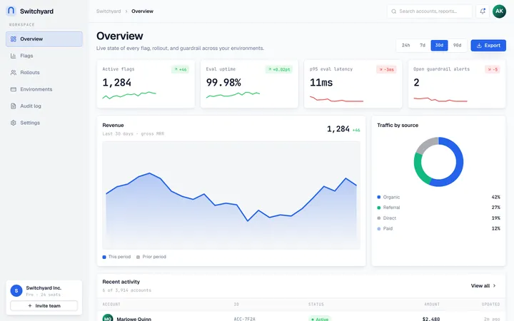
Dashboard
layoutA cloud-platform aesthetic of modular grids, glass-like panels, and crisp data hierarchy built for productivity dashboards that need to feel calm under heavy information.
Application
layoutA developer-first app shell with top-bar navigation, card-based panels, and dense, no-nonsense workflows built for getting things done.