Application
Equips app dashboards with top-bar navigation and card-based workflows.
- Version
- v1.0.0 · Updated Jul 18, 2026
- Context
- ≈1,969 tokens
- Security
- ✓ scanned
- License
- Single seat
- Works with
- Claude Code, Cursor, Codex
Checkout opens soon · launches at $9
≈1,969 tokens · v1.0.0
Live demo — an original page built in the Application style. Open in new tab
About this skill
App dashboard with purple-themed aesthetic, top-bar navigation, card-based layouts, and developer-first workflows. Its live demo renders an analytics dashboard — KPI tiles, revenue charts, and a data table.
The skill file
Application is a pragmatic app-shell aesthetic built for products people use all day. It leads with a top navigation bar, organizes everything into clean white cards on a soft canvas, and favors information density over decoration—the look developers and operators expect from serious tooling. Reach for it when you're building a dashboard, console, or admin surface where speed, scannability, and keyboard-driven workflows matter more than flourish.
Design principles
- Top-bar first: global navigation lives in a persistent header so the full width is free for work.
- Cards as containers: discrete white panels group related data and keep the canvas organized.
- Density with air: tighter than marketing UI, but never cramped—every element has room to be tapped and read.
- Workflow-driven: primary actions, search, and shortcuts are always within reach.
- Status is everywhere: badges, dots, and color codes communicate state at a glance.
- Mono where it counts: IDs, timestamps, counts, and code use tabular monospace for alignment.
Color
The canvas is a soft slate (#F8FAFC) so white cards (#FFFFFF) read as clearly elevated containers. Text is near-black slate (#0F172A) with muted secondary (#64748B) for metadata. The primary action color is a confident blue #2563EB—used for primary buttons, active nav, links, and focus rings. Emerald #10B981 is the success/secondary accent for positive status, healthy metrics, and confirmations. Borders are light (#E2E8F0). Reserve amber #F59E0B and red #EF4444 for warning and error states respectively.
For dark mode, set the canvas to #0B1120, cards to #111827, foreground to #E5E7EB, and borders to #1F2937. Brighten blue to #3B82F6 and emerald to #34D399 so status remains legible against the dark surface.
Token reference
| Token | Light | Dark | Role |
|---|---|---|---|
| background | #F8FAFC | #0B1120 | App canvas |
| surface | #FFFFFF | #111827 | Cards, tables, panels |
| primary | #2563EB | #3B82F6 | Primary action, active nav |
| secondary | #10B981 | #34D399 | Success, healthy status |
| foreground | #0F172A | #E5E7EB | Primary text |
| muted | #64748B | #94A3B8 | Metadata, captions |
| border | #E2E8F0 | #1F2937 | Hairlines, table rules |
| warning | #F59E0B | #FBBF24 | Pending, attention |
| danger | #EF4444 | #F87171 | Errors, destructive |
Map status to a fixed semantic set—healthy/emerald, pending/amber, failed/red, neutral/slate—and reuse it across badges, dots, and chart series so color stays predictable across the app.
- Typography
- Layout & spacing
- Components
- Motion
- Accessibility
- Do & don't
- Use it with your AI tool
Preview ends here
Typography, Layout & spacing, Components, Motion, Accessibility, Do & don't & Use it with your AI tool unlock when checkout opens. Get notified
What's inside
- SKILL.md7.8 KB
More in Design
View allEditorial Pack
Collects the editorial cluster — typography-led, content-first pages in one install.
Design Systems Pack
Bundles every aesthetic design system in one install — switch styles per project.
Fiction
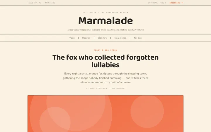
Illustrates children's-book warmth with bold outlines and saturated color.

Arcade
Presses chunky pixel buttons and rainbow shadows into arcade-cabinet fun.
More from @staqd
View profileEditorial Pack
Collects the editorial cluster — typography-led, content-first pages in one install.
Design Systems Pack
Bundles every aesthetic design system in one install — switch styles per project.
Fiction
Illustrates children's-book warmth with bold outlines and saturated color.
Arcade
Presses chunky pixel buttons and rainbow shadows into arcade-cabinet fun.