Live demo — an original page built in the Editorial style. Open in new tab
Editorial
A magazine-grade design system that makes typography the hero, pairing structured grids with generous whitespace and confident headlines.
Install via CLI
$ npx staqd add editorialThe skill file
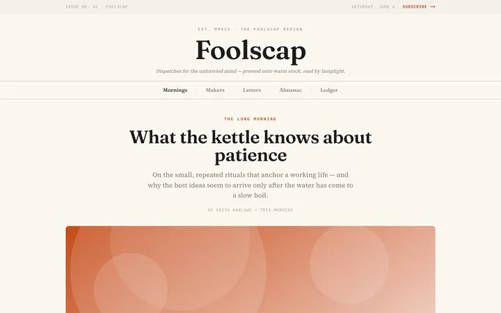
Editorial treats the page like a printed spread. Type is not decoration here — it is the architecture. The style leans on a refined serif voice, a warm paper background, and disciplined grids so that words breathe and imagery feels curated rather than crammed.
Reach for Editorial when the content itself is the product: essays, journalism, brand stories, and any interface where reading is the primary act. The result should feel like a beautifully art-directed magazine that happens to live on a screen — calm, confident, and unmistakably premium.
Design principles
- Lead with typography. Headlines do the heavy lifting; everything else stays quiet and supportive.
- Respect the measure. Keep body text around 60-72 characters per line so reading never strains.
- Use rules, not boxes. Hairline dividers and column gutters create structure without heavy containers or drop shadows.
- Restrain color. A single warm accent marks links and emphasis; the rest is ink on paper.
- Honor the grid, then break it intentionally for a single dramatic image or pull quote.
- Whitespace is content. Generous vertical rhythm signals quality and confidence.
Color
The foundation is a warm paper background (#FAF8F3) with near-black ink (#1A1714) for text, which reads softer and more premium than pure black on white.
Surfaces such as cards or callouts lift to pure white (#FFFFFF) to feel like an inset clipping pasted onto the page. The rust accent (#B23A2E) is used sparingly — links, active states, pull-quote marks — and never as a flood of color. Muted ink (#6E665B) carries metadata, captions, and kickers, while borders are a faint sand (#E4DFD4) used only as 1px rules.
Light mode is the home of this style: paper, ink, and a single warm accent. Dark mode inverts to a deep espresso background (#16110D) with parchment text (#EDE7DC); warm the accent slightly to #D26352 so it stays legible against the dark field, and keep rules at #33291F.
Typography
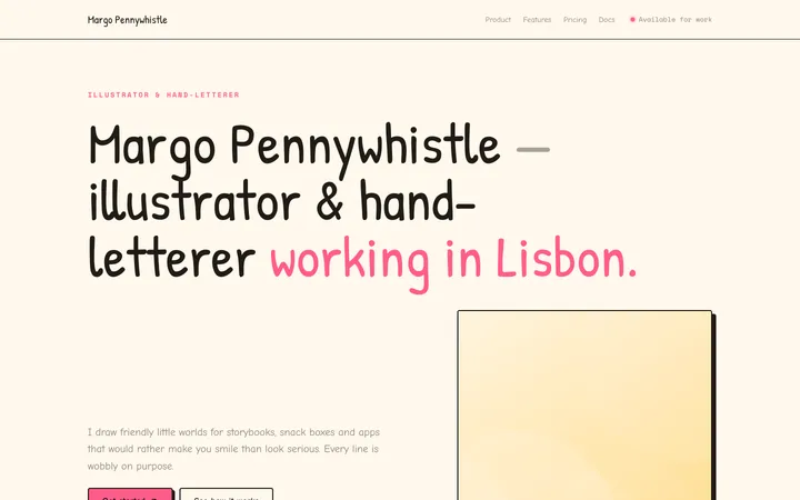
A high-contrast display serif carries every heading, set in tight tracking (-0.02em) at large sizes for that printed-masthead authority. Body copy uses a readable text serif at 18-20px with line-height 1.7 for long-form comfort.
- Headlines: display serif, bold (700), 56-96px, -0.02em tracking.
- Subheads / decks: body serif italic, 22-28px, regular weight, muted ink.
- Body: body serif, 18-20px, line-height 1.7, weight 400.
- Kickers & labels: 12-13px uppercase, +0.08em tracking, muted ink, often in small caps.
- Emphasis: real italics and a single medium (500) weight — never faux-bold body.
Weights stay disciplined so the page never feels noisy: regular for body, medium for emphasis, and one bold reserved for top-level headlines.
Layout & spacing
Work on a 12-column grid with a comfortable 24px gutter and a max content width around 1200px, while the reading column itself caps near 680px.
Spacing follows an 8px base with a strong vertical rhythm — section breaks get 64-96px of air. Density is deliberately low; never let elements touch. Captions and footnotes align to the column edge to reinforce the grid, and full-bleed images are welcome as a counterpoint to the tight reading column.
Components
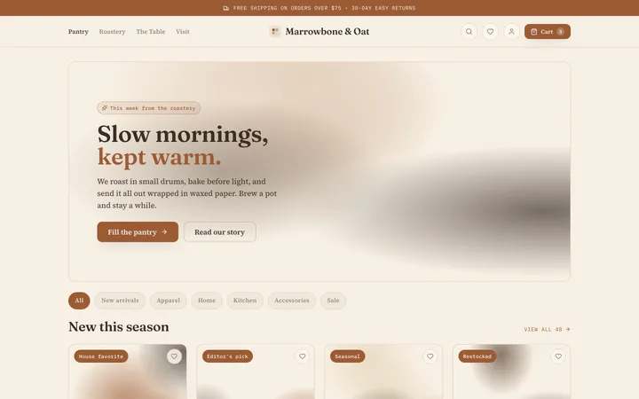
- Buttons: solid rust fill with white serif label and a 2px radius for primary; secondary is a text link with an animated underline.
- Inputs: borderless or single underline rule, with a focus state that thickens the underline to the rust accent.
- Cards: no shadow, no heavy border — separated by whitespace and a top hairline rule, with a kicker, serif headline, and muted deck.
- Navigation: a slim top bar with the masthead wordmark centered or left, links in small-caps, and a thin bottom rule rather than a shadow.
- Modals & overlays: paper-colored sheets centered with ample padding, a thin rule header, and a backdrop of rgba(26,23,20,0.4).
- Tables: ruled rows with no vertical lines, generous cell padding, and small-caps column headers in muted ink.
- Badges: understated — small-caps text with a hairline outline or a faint sand background, never loud pills.
- Pull quotes: large italic serif, indented, with a rust vertical rule or oversized opening quotation mark.
Motion
Motion is subtle and print-respectful — nothing should feel like a web app showing off.
- Links reveal an underline that wipes in over 200ms with an ease-out curve.
- Page and section transitions use gentle 300ms opacity-and-rise fades (8-12px translate).
- Hover states warm color slightly rather than jumping; presses dim to ~92% opacity.
Avoid bouncy or playful easing — everything should feel composed, like turning a page.
Accessibility
- Ink on paper (
#1A1714on#FAF8F3) exceeds 12:1 contrast; muted text stays above 4.5:1 for body sizes. - The rust accent on paper clears AA for large text and UI — always pair links with an underline so they never rely on color alone.
- Focus states use a visible 2px rust outline with a 2px offset, and are never removed.
- Respect
prefers-reduced-motionby disabling rise/fade transitions and keeping instant state changes. - Maintain a minimum 16px body size and ensure all interactive targets are at least 44x44px.
Meets WCAG 2.2 AA across text contrast, focus visibility, and target size.
Use it with your AI tool
Paste this skill into your AI coding tool (Claude, Cursor, Codex), then prompt for the component you need. Install: npx staqd add editorial
Use it with these prompts
Article layout
FreeBuild a long-form article page in the Editorial style: a large serif drop-headline, a deck subtitle in muted ink, a single-column measure of ~68 characters, and a thin rule separating sections. Use the warm paper background and reserve the rust accent for pull quotes and links only.
Homepage hero
ProNewsletter signup
ProMore editorial skills
Paper
editorialA clean, tactile interface inspired by real sheets of paper—soft shadows, gentle layering, and generous whitespace that make screens feel calm and physical.
Cafe
editorialA warm, handcrafted aesthetic of roasted earth tones, soft paper textures, and relaxed serif type that makes an interface feel like a favorite corner table.
Doodle
editorialA hand-drawn, sketchy interface full of wobbly lines and playful imperfection that makes products feel friendly, human, and creative.