Cafe
Warms interfaces with earthy tones, cozy textures, and handcrafted charm.
- Version
- v1.0.0 · Updated Jul 18, 2026
- Context
- ≈2,561 tokens
- Security
- ✓ scanned
- License
- Single seat
- Works with
- Claude Code, Cursor, Codex
Checkout opens soon · launches at $9
≈2,561 tokens · v1.0.0
Live demo — an original page built in the Cafe style. Open in new tab
About this skill
Cafe design is warm and inviting, with earthy tones, cozy textures, and relaxed typography that create a handcrafted, welcoming atmosphere. Its live demo renders an e-commerce storefront — collection hero, product cards, lookbook strip, and reviews.
The skill file
Cafe is a design system that feels like sunlight through a window onto a wooden table. It is built from roasted browns, creamy paper backgrounds, soft sage accents, and a relaxed serif voice that invites the reader to slow down. Reach for Cafe when warmth and craft matter more than speed — coffee shops, bakeries, recipe collections, lifestyle journals, and any brand that wants to feel handmade rather than mass-produced. The goal is hospitality: an interface that welcomes you in and lets you linger.
Design principles
- Warmth first: every surface tilts toward cream and toast, never cold gray or pure white.
- Texture invites touch — subtle paper grain and soft shadows give the screen a tactile, printed quality.
- Type is unhurried: serif headings and generous line-height set a calm reading pace.
- Color comes from the pantry — coffee, caramel, oat, and herb, used in muted, natural concentrations.
- Edges are gently rounded, like the lip of a ceramic mug or the corner of a menu card.
- Whitespace is hospitality; let content sit with room around it instead of crowding.
- Detail is handcrafted — dotted leaders, small glyphs, and ligatures hint at letterpress and signage.
Color
The base is a warm oat background (#F7F0E4) with a slightly lighter cream surface (#FBF6EC) for cards and panels, so layers feel like sheets of paper. Foreground text is a deep espresso brown (#3A2E26) rather than harsh black, which keeps the page soft on the eye, with muted captions in #8A7A66. The primary accent is roasted coffee (#9C5B34), used on buttons, links, and headings that need emphasis; the secondary is a calm sage (#7A8B6F) for confirmations, seasonal tags, and quiet highlights. Borders are a quiet tan (#E0D2BB) that separates without drawing a line.
Keep saturation low and earthy — these are colors that have been in the sun. Avoid pure white and true black entirely; they break the warmth instantly. For dark mode, brew it darker: background #241D17, surface #2E2620, foreground #F3E9DA, and borders #4A3D32, while keeping the roasted-coffee and sage accents but lifting them slightly (#C0794E, #94A487) so they glow against the dark wood. Think of the dark theme as the same cafe in the evening, lit by lamplight rather than daylight.
Token reference
background#F7F0E4— warm oat page canvas, the daylight base.surface#FBF6EC— cream cards and panels, like menu paper.primary#9C5B34— roasted-coffee buttons, links, emphasized headings.secondary#7A8B6F— sage for confirmations, seasonal tags, soft accents.foreground#3A2E26— espresso body and heading text.muted#8A7A66— captions, hours, prices, low-emphasis labels.border#E0D2BB— quiet tan hairlines and card outlines.
- Typography
- Layout & spacing
- Components
- Motion
- Responsive behavior
- Accessibility
- Use it with your AI tool
Preview ends here
Typography, Layout & spacing, Components, Motion, Responsive behavior, Accessibility & Use it with your AI tool unlock when checkout opens. Get notified
What's inside
- SKILL.md10 KB
More in Design
View allEditorial Pack
Collects the editorial cluster — typography-led, content-first pages in one install.
Design Systems Pack
Bundles every aesthetic design system in one install — switch styles per project.
Fiction
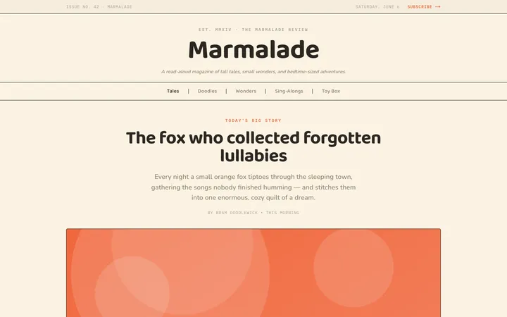
Illustrates children's-book warmth with bold outlines and saturated color.

Arcade
Presses chunky pixel buttons and rainbow shadows into arcade-cabinet fun.
More from @staqd
View profileEditorial Pack
Collects the editorial cluster — typography-led, content-first pages in one install.
Design Systems Pack
Bundles every aesthetic design system in one install — switch styles per project.
Fiction
Illustrates children's-book warmth with bold outlines and saturated color.
Arcade
Presses chunky pixel buttons and rainbow shadows into arcade-cabinet fun.