Friendly
Welcomes users with soft shapes, clear hierarchy, and inviting warmth.
- Version
- v1.0.0 · Updated Jul 18, 2026
- Context
- ≈1,171 tokens
- Security
- ✓ scanned
- License
- Single seat
- Works with
- Claude Code, Cursor, Codex
Checkout opens soon · launches at $9
≈1,171 tokens · v1.0.0
Live demo — an original page built in the Friendly style. Open in new tab
About this skill
Friendly design feels warm and approachable, using soft shapes, clear hierarchy, and inviting visuals to make interactions easy and welcoming. Its live demo renders a mobile app landing page — phone mockups, feature tiles, mini charts, and app-store CTAs.
The skill file
Friendly is the warmth of a product that wants to put people at ease. It is built from rounded corners, soft shadows, a sunny coral accent, and a typeface with gentle curves, all working together to feel approachable rather than intimidating. Reach for Friendly when you are building for everyday people, when onboarding needs to feel reassuring, or when a brand wants to come across as human, helpful, and kind.
Design principles
- Round everything. Soft corners and circular shapes feel safe and inviting.
- Warm the canvas. A cream-tinted background is gentler than stark white.
- Lead with a sunny accent. Coral #FF7A59 brings energy without aggression.
- Speak plainly and kindly. Copy and visuals reduce anxiety at every step.
- Use breathing room. Generous spacing keeps the experience relaxed.
- Add small delights. Subtle bounce and playful touches reward interaction.
Color
The background is a soft, warm #FFF9F4 that feels like paper in morning light, with clean #FFFFFF cards floating on top. The primary accent is a friendly coral #FF7A59 used for buttons, highlights, and key moments. A cheerful teal #4ECDC4 serves as the secondary accent for tags, illustrations, and supportive states. Foreground text is a soft charcoal #2D2A32 rather than harsh black, with #7A7480 for muted labels. Borders are barely-there and warm at #F0E7DF. For dark mode, settle into a cozy #1E1B22 background, #2A262F surfaces, keep #FF7A59 and #4ECDC4 as accents, and use #F4EFE9 for foreground so the warmth carries through.
Typography
Quicksand gives headings their rounded, friendly personality at 700 weight with relaxed 0 tracking. Nunito carries body copy at 400 to 500 weight with a generous 1.6 line-height that feels open and easy to read. The scale is a gentle 1.25x progression so nothing feels sharp or shouty. Numerals and code use Fira Code. Tone is conversational: pair the rounded type with plain-language microcopy that reassures rather than instructs. Emphasis comes from weight and the coral accent, keeping everything soft.
- Layout & spacing
- Components
- Motion
- Accessibility
- Use it with your AI tool
Preview ends here
Layout & spacing, Components, Motion, Accessibility & Use it with your AI tool unlock when checkout opens. Get notified
What's inside
- SKILL.md4.7 KB
More in Design
View allEditorial Pack
Collects the editorial cluster — typography-led, content-first pages in one install.
Design Systems Pack
Bundles every aesthetic design system in one install — switch styles per project.
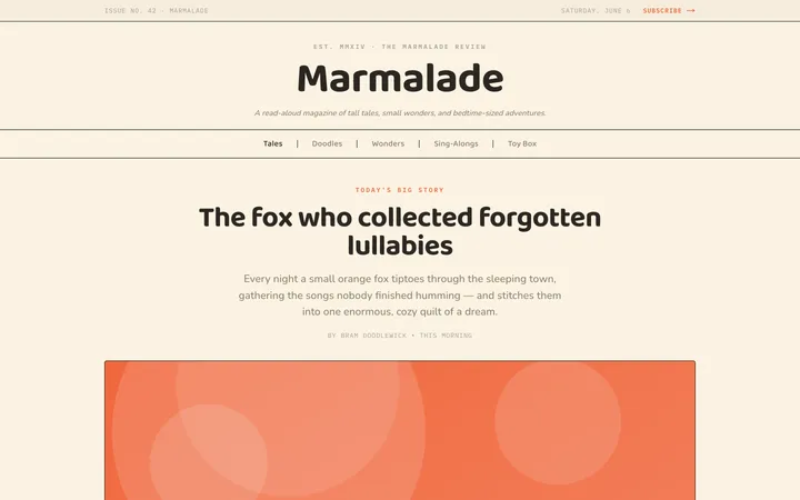
Fiction
Illustrates children's-book warmth with bold outlines and saturated color.

Arcade
Presses chunky pixel buttons and rainbow shadows into arcade-cabinet fun.
More from @staqd
View profileEditorial Pack
Collects the editorial cluster — typography-led, content-first pages in one install.
Design Systems Pack
Bundles every aesthetic design system in one install — switch styles per project.
Fiction
Illustrates children's-book warmth with bold outlines and saturated color.
Arcade
Presses chunky pixel buttons and rainbow shadows into arcade-cabinet fun.