Refined
Polishes every detail — precise spacing, subtle contrast, quiet elegance.
- Version
- v1.0.0 · Updated Jul 18, 2026
- Context
- ≈1,255 tokens
- Security
- ✓ scanned
- License
- Single seat
- Works with
- Claude Code, Cursor, Codex
Checkout opens soon · launches at $9
≈1,255 tokens · v1.0.0
Live demo — an original page built in the Refined style. Open in new tab
About this skill
Refined design is elegant and understated, using precise spacing, subtle contrast, and polished details to create a premium, professional interface. Its live demo renders a magazine front page — masthead, lead story with pull quote, story grid, and newsletter signup.
The skill file
Refined is polish without flash. It works in soft warm neutrals, exact spacing, and gentle contrast, pairing an elegant serif with a calm sans to feel professional and considered. Where bolder styles announce themselves, Refined earns trust through restraint and precision — the sense that someone cared about every margin. Reach for it when credibility, taste, and a grown-up tone matter: consultancies, editorial work, portfolios, and B2B products that want to feel mature rather than trendy.
Design principles
- Precision over punch — perfect spacing and alignment carry the polish, not loud color.
- Keep contrast gentle: soft warm neutrals, hairline borders, low-key shadows.
- Pair a refined serif for headings with a quiet sans for body to balance character and clarity.
- Use a single muted, sophisticated accent — never bright or saturated.
- Hold a strict vertical rhythm so the whole page feels measured and intentional.
- Let small editorial details (small caps, a drop cap, a hairline rule) do the elevating.
Color
The canvas is a warm off-white #FBFBFA with crisp #FFFFFF surfaces and a soft secondary tone #F1F0EC for grouping. The accent is a muted slate blue #3D5A80 — understated and trustworthy — used for links, primary actions, and quiet emphasis. Foreground text is a warm near-black #26261F that reads softer than pure black; muted copy steps to #76746C. Borders are a light warm #E4E2DB. The palette stays deliberately low-saturation so nothing competes with the content or the typography. For a dark variant, move to a warm charcoal #1C1B18 canvas, #24231F surfaces, #ECEAE3 text, and a slightly lifted slate #5C7BA6 accent to maintain contrast and the same composed mood.
Typography
Headings use a flexible, characterful serif (Fraunces) at 500 weight with -0.008em tracking, lending warmth and editorial credibility. Body runs in a clean neutral sans (Inter) at 400 with a comfortable 1.65 line-height. Section labels and metadata use small caps tracked to +0.08em for a tailored feel. The measured 1.25 scale keeps the hierarchy balanced — present but never aggressive. A serif drop cap or a tracked small-caps eyebrow is a signature refined touch in long-form layouts.
- Layout & spacing
- Components
- Motion
- Accessibility
- Use it with your AI tool
Preview ends here
Layout & spacing, Components, Motion, Accessibility & Use it with your AI tool unlock when checkout opens. Get notified
What's inside
- SKILL.md5.0 KB
More in Design
View allEditorial Pack
Collects the editorial cluster — typography-led, content-first pages in one install.
Design Systems Pack
Bundles every aesthetic design system in one install — switch styles per project.
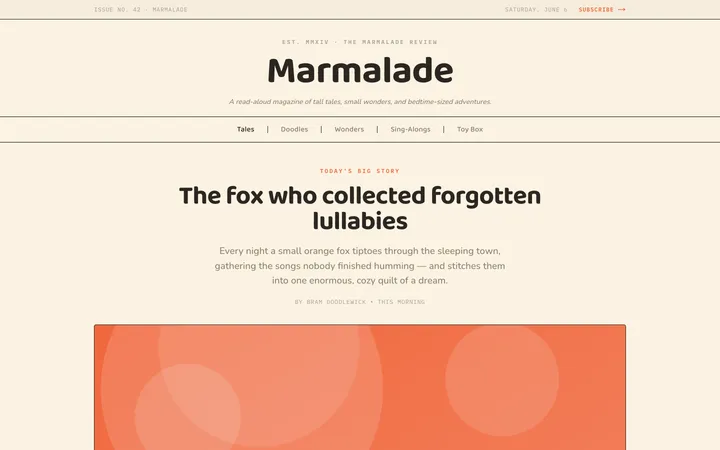
Fiction
Illustrates children's-book warmth with bold outlines and saturated color.

Arcade
Presses chunky pixel buttons and rainbow shadows into arcade-cabinet fun.
More from @staqd
View profileEditorial Pack
Collects the editorial cluster — typography-led, content-first pages in one install.
Design Systems Pack
Bundles every aesthetic design system in one install — switch styles per project.
Fiction
Illustrates children's-book warmth with bold outlines and saturated color.
Arcade
Presses chunky pixel buttons and rainbow shadows into arcade-cabinet fun.