Live demo — an original page built in the Terracotta style. Open in new tab
Terracotta
A sun-baked editorial style with warm cream surfaces, ink-brown serif headlines, and a single clay accent built for long, comfortable reading.
Install via CLI
$ npx staqd add terracottaInside this skill
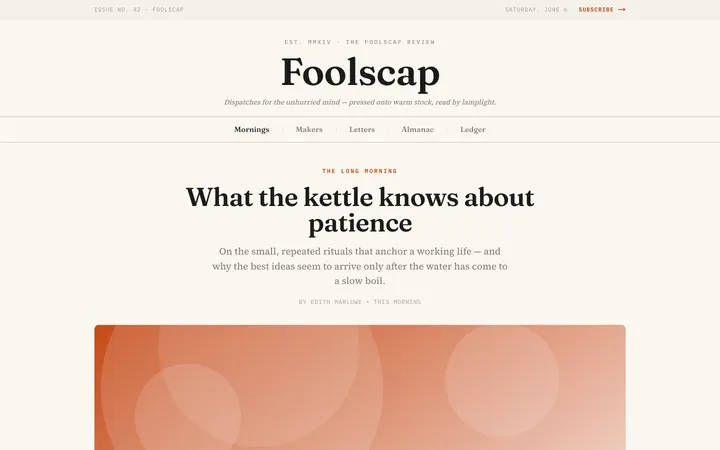
Terracotta is an editorial style that feels like reading by a warm window in late afternoon. It pairs a creamy paper ground with ink-brown serif typography and a single sun-fired clay accent, prioritizing comfort and calm over flash. Everything is tuned for long-form reading: generous line-height, a measured column width, and quiet contrast that never strains the eye. Reach for Terracotta when the words matter most, for essays, journals, artisan brands, and anything that wants to feel handmade and unhurried.
Design principles
- Reading comes first: every type decision serves comfort and rhythm over the full length of a page.
- Warmth throughout: no cold grays, no pure white, no harsh black; the whole palette is sun-baked.
- One accent only: clay terracotta carries all emphasis so the page never feels busy.
- Quiet structure: hairline borders and gentle surface shifts replace heavy dividers and boxes.
- Honor the serif: classic editorial typesetting with proper measure, leading, and pull quotes.
- Let whitespace do the work; the page should feel airy, not packed.
Terracotta is a Pro skill
Unlock the full Terracotta spec — design tokens, component coverage, motion, and accessibility — plus the entire library of design skills and Pro prompts.
- Every design skill, growing weekly
- Full Pro prompt library + unlimited MCP
- Commercial-use rights on output
Use it with these prompts
Editorial article page
FreeBuild a long-form article page in the Terracotta style: warm cream background, an ink-brown Fraunces headline, serif body at a comfortable reading measure (around 68 characters), a clay terracotta drop cap on the first paragraph, and pull quotes set off with a terracotta left rule.
Artisan product story
ProMagazine homepage grid
ProMore editorial skills
Paper
editorialA clean, tactile interface inspired by real sheets of paper—soft shadows, gentle layering, and generous whitespace that make screens feel calm and physical.
Cafe
editorialA warm, handcrafted aesthetic of roasted earth tones, soft paper textures, and relaxed serif type that makes an interface feel like a favorite corner table.
Doodle
editorialA hand-drawn, sketchy interface full of wobbly lines and playful imperfection that makes products feel friendly, human, and creative.