Live demo — an original page built in the Creative style. Open in new tab
Creative
A boundary-breaking system of asymmetric layouts, expressive type, and surprising interactions for interfaces that feel like art directed experiences.
Install via CLI
$ npx staqd add creativeInside this skill
Creative is for interfaces that want to feel made, not generated — art-directed experiences with personality, tension, and surprise. It throws out the safe centered grid in favor of asymmetry, oversized expressive type, bold outlines, unexpected color pops, and interactions that reward exploration. The result feels like an editorial spread or a designer's portfolio rather than a default template. Reach for it when the goal is to impress and differentiate: portfolios, agency sites, campaign pages, and brand storytelling.
Design principles
- Break the grid on purpose. Asymmetry, overlap, and off-axis placement create energy and intentionality.
- Type as the hero. Oversized, expressive display headings carry the design — words are visual elements.
- Bold structure, flat surfaces. Hard outlines and dramatic offset shadows replace soft elevation.
- Strategic color shocks. A mostly warm-neutral canvas makes a single electric accent land harder.
- Motion as narrative. Scroll, hover, and reveal interactions tell a story rather than just decorate.
- Confident restraint. One or two surprising moves per screen — not chaos, but curated boldness.
Creative is a Pro skill
Unlock the full Creative spec — design tokens, component coverage, motion, and accessibility — plus the entire library of design skills and Pro prompts.
- Every design skill, growing weekly
- Full Pro prompt library + unlimited MCP
- Commercial-use rights on output
Use it with these prompts
Editorial hero
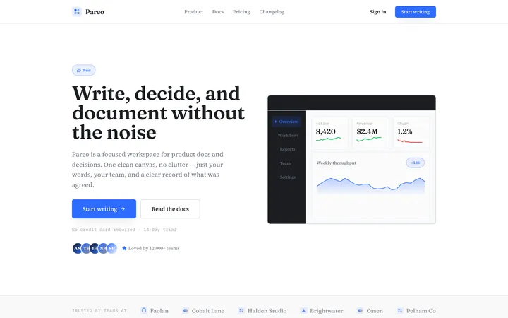
FreeBuild a Creative-style editorial hero: an oversized Clash Display headline that overlaps a tilted image block, an off-grid asymmetric layout on a warm #F7F3EC canvas, a bright orange accent, and a magnetic CTA button. Make it feel art-directed, not templated.
Scroll story
ProProject showcase
ProMore tone skills
Clean
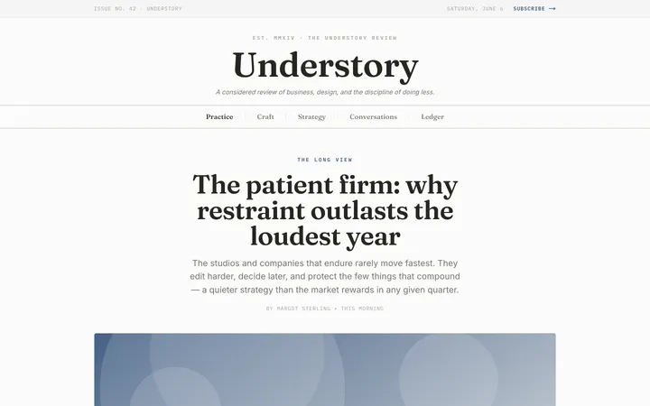
toneA minimal, distraction-free system where generous whitespace and crisp type let content do all the talking.
Premium
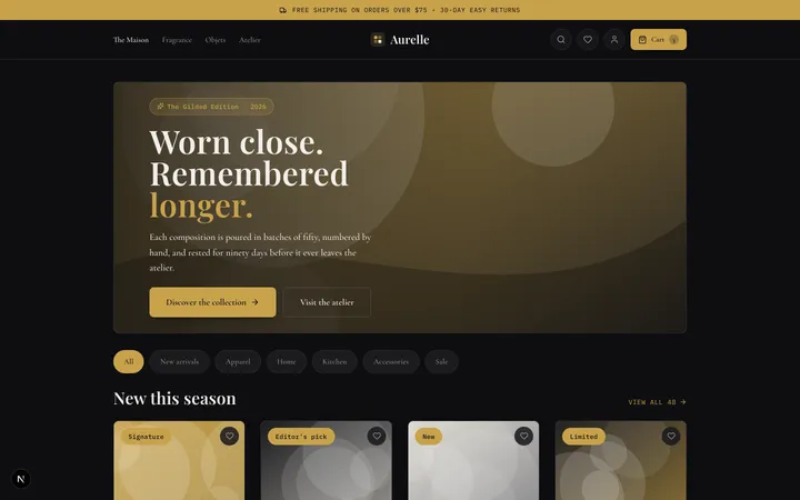
toneA high-end, exclusive look built on deep tones, gold-leaf accents, and serif-led typography that feels expensive on contact.
Refined
toneAn understated, professional look where precise spacing and subtle contrast turn small details into quiet polish.