Storytelling
Paces content like a story — hierarchy, imagery, and emotional flow.
- Version
- v1.0.0 · Updated Jul 18, 2026
- Context
- ≈1,402 tokens
- Security
- ✓ scanned
- License
- Single seat
- Works with
- Claude Code, Cursor, Codex
Checkout opens soon · launches at $9
≈1,402 tokens · v1.0.0
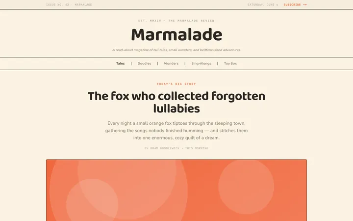
Live demo — an original page built in the Storytelling style. Open in new tab
About this skill
Storytelling design guides users through content with emotion and flow, using visual hierarchy, imagery, and pacing to create a narrative-driven experience. Its live demo renders a magazine front page — masthead, lead story with pull quote, story grid, and newsletter signup.
The skill file
Storytelling treats a page like a narrative, not a noticeboard. Instead of dropping facts in a grid, it paces them — an opening scene, rising detail, a turning point, a resolution — so the reader is carried rather than informed. Editorial serif type, full-bleed imagery, and deliberate rhythm give the content emotion and momentum. Reach for Storytelling when the message benefits from being felt: brand and founder stories, long-form features, case studies, and launches that want a beginning, middle, and end.
Design principles
- Structure the page as a sequence of scenes, each with a single emotional beat.
- Pace with whitespace and imagery — control how fast the eye moves down the page.
- Lead with one oversized moment per section; let the rest support it.
- Use imagery as narrative, not decoration; caption it like a photo essay.
- Interrupt prose with pull-quotes to mark emotional peaks.
- Keep the reading column narrow and the voice warm, so the page reads like an essay.
Color
The palette feels like fine print stock. The background is a warm paper cream (#FBF8F3) with pure white (#FFFFFF) surfaces for inset cards and quotes, giving the page a printed, tactile warmth. Text is a deep warm near-black (#1A1714), softer than pure black, to suit long reading. The accent is a confident terracotta-coral (#E0613A) used for pull-quotes, chapter labels, links, and one closing call to action — a warm spark against the neutral paper. Muted warm taupe (#6B6258) carries captions and bylines, and borders are a soft sand (#E7E0D5). In dark mode, move to a dim espresso background (#1B1814), surfaces at #26211B, foreground cream (#F1EBE1), muted taupe #A99E8E, and brighten the terracotta to #F0764D so it still glows against the dark, lamplit page.
Typography
Type does the emotional work. Display headlines use Fraunces (or Playfair Display), a high-contrast serif with character, sized cinematically for opening moments. Body copy is Source Serif 4 (or Georgia) at a comfortable 18–20px with an open 1.7 line-height for immersive reading. The scale is dramatic — roughly a 1.5 ratio for display moments (18 / 27 / 41 / 61px) — so opening headlines feel like titles on a page. Drop-caps anchor the first paragraph of a chapter; pull-quotes are set large in terracotta with generous space. Chapter labels use small-caps with wide tracking. Captions and bylines are small, taupe, and quiet.
- Layout & spacing
- Components
- Motion
- Accessibility
- Use it with your AI tool
Preview ends here
Layout & spacing, Components, Motion, Accessibility & Use it with your AI tool unlock when checkout opens. Get notified
What's inside
- SKILL.md5.6 KB
More in Design
View allEditorial Pack
Collects the editorial cluster — typography-led, content-first pages in one install.
Design Systems Pack
Bundles every aesthetic design system in one install — switch styles per project.
Fiction
Illustrates children's-book warmth with bold outlines and saturated color.

Arcade
Presses chunky pixel buttons and rainbow shadows into arcade-cabinet fun.
More from @staqd
View profileEditorial Pack
Collects the editorial cluster — typography-led, content-first pages in one install.
Design Systems Pack
Bundles every aesthetic design system in one install — switch styles per project.
Fiction
Illustrates children's-book warmth with bold outlines and saturated color.
Arcade
Presses chunky pixel buttons and rainbow shadows into arcade-cabinet fun.