Live demo — an original page built in the Claymorphism style. Open in new tab
Claymorphism
Soft, puffy surfaces molded from light and shadow—rounded, tactile, and playful, like pressing buttons made of pastel clay.
Install via CLI
$ npx staqd add claymorphismThe skill file
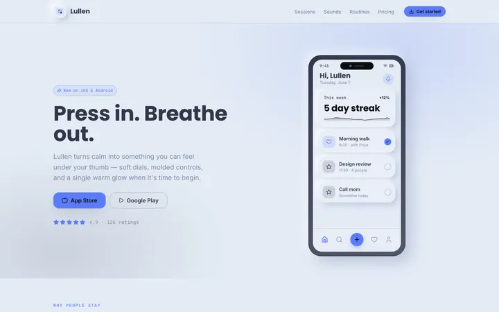
Claymorphism turns flat UI into something you almost want to squish. Surfaces look molded from soft pastel clay—rounded corners, puffy edges, and a pairing of inner highlights with outer drop shadows that make every element feel raised and touchable. It's warm, friendly, and unmistakably playful, perfect for products that want to feel approachable rather than corporate. Reach for it on consumer apps, onboarding, and anything where delight and tactility beat density.
Design principles
- Everything is rounded: large radii (20–28px) on cards, buttons, inputs, and icons—no sharp corners anywhere.
- Dual-shadow depth: each surface combines a soft outer drop shadow with an inner light highlight to read as puffy clay.
- Pastel and soft: low-to-mid saturation colors on a tinted, airy background keep the mood gentle.
- Chunky and touch-first: generous padding and large hit targets make it feel made for fingers.
- Playful but legible: rounded type and bright accents stay readable, never sacrificing clarity for cuteness.
- Pressed vs. raised: interactive states swap between raised (default) and inset (active) to mimic physical pressing.
Color
The background is a soft lilac wash (#F0EEFB) so white-ish surfaces (#FBFAFF) read as gently raised clay. Text is a deep plum (#2E2A45) with a muted secondary (#8A82A8). The hero accent is a friendly violet #7C5CFC, used for primary buttons, active toggles, and key icons. Supporting accents are candy pink #FF8FB1 and warm yellow #FFD66B, sprinkled as icon blobs, chips, and highlights. Borders are barely-there lavender (#E3DEF6)—the shadows do most of the separating, not strokes.
For dark mode, shift to a deep plum background (#211C33) with surfaces at #2C2545, foreground at #F0EEFB, and muted at #A79FC4. Keep the violet at #9277FF, pink at #FF9EBE, and yellow at #FFDC7E. Soften the outer shadow and replace the white inner highlight with a subtle lighter-plum inset so surfaces still look molded.
Token reference
| Token | Light | Dark | Role |
|---|---|---|---|
| background | #F0EEFB | #211C33 | Page canvas |
| surface | #FBFAFF | #2C2545 | Cards, panels, sheets |
| primary | #7C5CFC | #9277FF | Primary buttons, active toggles |
| secondary | #FF8FB1 | #FF9EBE | Accent chips, secondary actions |
| accent-warm | #FFD66B | #FFDC7E | Highlights, icon blobs |
| foreground | #2E2A45 | #F0EEFB | Body and heading text |
| muted | #8A82A8 | #A79FC4 | Captions, helper text |
| border | #E3DEF6 | #3A3257 | Soft hairlines (rarely needed) |
| success | #3FB984 | #5FD6A0 | Positive status |
| danger | #F5648B | #FF7CA0 | Errors, destructive |
Keep accent fills soft—mix any accent with white at 70–85% for chip and badge backgrounds so the palette stays pastel rather than candy-bright.
Typography
Headings use Quicksand (or Nunito) at weights 600–700 for a rounded, friendly silhouette; body is Nunito at 400–500. The scale is a comfortable 1.25 ramp with a 16px base and a roomy 1.6 line-height, default tracking. Keep headlines short and warm in tone. Fira Code covers any code or numeric display. Rounded letterforms reinforce the soft, clay-like personality, so avoid condensed or sharp grotesque fonts here.
| Role | Size / line-height | Weight | Tracking |
|---|---|---|---|
| Display | 49px / 1.15 | 700 | 0 |
| H1 | 39px / 1.2 | 700 | 0 |
| H2 | 31px / 1.25 | 600 | 0 |
| H3 | 25px / 1.3 | 600 | 0 |
| Body large | 20px / 1.6 | 500 | 0 |
| Body | 16px / 1.6 | 400 | 0 |
| Caption | 14px / 1.5 | 500 | 0 |
Layout & spacing
Layouts are airy and generous: lots of breathing room, an 8px base scale skewing larger (16 / 24 / 32 / 48). Cards carry 24–32px internal padding so content floats inside the clay. Content sits in a comfortable max width (around 720px for mobile-leaning flows, 1100px for wider apps) and centers happily. Stack elements with 16–24px gaps so each puffy surface has space to cast its shadow. Favor single-column, card-stacked compositions over dense grids.
Components
- Buttons: chunky pills (full or 20px+ radius) with the dual clay shadow; raised by default, visibly pressed-in on click; primary in violet, secondary in soft pink, ghost as a tinted-transparent pill.
- Inputs: rounded 16–20px fields with a soft inset shadow so they look carved into the surface; focus adds a violet glow ring.
- Cards: 24px radius, light surface, outer drop shadow plus inner top highlight; often paired with a rounded pastel icon blob.
- Toggles & switches: pill tracks that look inset when off and raised with a violet fill when on; sliders use puffy thumbs.
- Navigation: rounded bottom tab bar or floating pill nav; active item gets a raised clay highlight and accent color.
- Modals & sheets: bottom sheets and centered cards with big radii, a soft blurred lilac scrim, and a rounded drag handle.
- Badges & chips: small soft pills in pastel tints with rounded icons.
- Empty states: friendly rounded illustration blob, warm headline, and a single chunky pill action.
- Tooltips: rounded clay bubble in deep plum with white text, a soft drop shadow, and a small rounded pointer.
- Progress: thick rounded tracks with an inset shadow and a violet puffy fill that looks raised above the groove.
Anatomy of a clay surface
- Base: light surface fill
#FBFAFF, 24px radius, no hard border. - Outer shadow:
8px 16px 32px rgba(91,75,138,0.18)to lift the element off the lilac canvas. - Inner top highlight:
inset 0 2px 4px rgba(255,255,255,0.9)so the upper edge catches light. - Inner bottom shade:
inset 0 -3px 6px rgba(91,75,138,0.12)to round the lower lip. - Combine all three in a single
box-shadowstack—this trio is what reads as molded clay.
Pressed vs. raised states
- Raised (default): full outer shadow plus inner highlight; element floats above the canvas.
- Hover: outer shadow grows ~20% and the surface lifts 2–3px.
- Pressed/active: drop the outer shadow, deepen the inner bottom shade, and scale to ~96% so it looks squished into the canvas.
- Toggle on: thumb slides and the track fills violet with a raised inner highlight; toggle off: track sits inset and gray.
Motion
Motion is bouncy and tactile but controlled. Buttons depress with a quick scale-down to ~96% and a shadow softening over 120ms, then spring back. Cards and sheets enter with a gentle spring (cubic-bezier(0.34, 1.56, 0.64, 1)) over 240ms. Toggles animate the thumb with a soft overshoot. Hovers lift surfaces 2–3px with a slightly deeper shadow over 160ms. Keep springs subtle—playful, not chaotic—so the clay feels squishy rather than jittery.
Accessibility
Meets WCAG 2.2 AA: plum #2E2A45 on the lilac/white surfaces clears 11:1, and violet #7C5CFC on white reaches 4.6:1 for buttons and large text—use a darker violet (#6A48F0) for small text on light fills if needed. Because the style relies on shadow for depth, never use shadow as the sole signal of state; pair pressed/raised toggles with color and an on/off label. Focus states show a clear violet glow ring with offset, visible against soft surfaces, for keyboard users. Honor prefers-reduced-motion by removing springs and overshoot, keeping only quick fades. Keep hit targets at least 48x48px—easy, given the chunky aesthetic—and ensure inputs retain persistent labels.
Do & don't
- Do stack all three clay shadows (outer drop, inner highlight, inner shade) so surfaces read as truly molded.
- Do keep accents pastel and let shadow—not borders—create separation.
- Do make pressed states visibly squish so the tactility comes through.
- Do give every element a generous radius and roomy padding; nothing should feel sharp or cramped.
- Don't let springs overshoot wildly—keep the bounce gentle and brief.
- Don't rely on shadow alone to signal a toggle's state; always pair with color and a label.
- Don't drop below 4.5:1 contrast for small text on light clay—darken the violet to
#6A48F0when needed.
Use it with your AI tool
Paste this skill into your AI coding tool (Claude, Cursor, Codex), then prompt for the component you need. Install: npx staqd add claymorphism
Use it with these prompts
Clay card
FreeBuild a Claymorphism feature card with a 24px radius, a soft puffy surface using dual inner-highlight and outer drop shadows, a pastel violet icon blob, a rounded Quicksand heading, and a chunky pill button.
Mobile onboarding
ProSettings panel
ProMore aesthetic skills
Neumorphism
aestheticA soft, extruded interface where elements appear to push out of or press into a single continuous surface using paired light and dark shadows.
Artistic
aestheticAn expressive, hand-made design system blending organic blobs, playful illustration, and unconventional layouts into interfaces that feel like a living sketchbook.
Perspective
aestheticA spatial design system that uses angled planes, layered depth, and foreshortening to give flat screens a dynamic, three-dimensional sense of direction.