Corporate
Formalizes layouts with restrained color and structure that reads as trust.
- Version
- v1.0.0 · Updated Jul 18, 2026
- Context
- ≈1,419 tokens
- Security
- ✓ scanned
- License
- Single seat
- Works with
- Claude Code, Cursor, Codex
Checkout opens soon · launches at $9
≈1,419 tokens · v1.0.0
Live demo — an original page built in the Corporate style. Open in new tab
About this skill
Corporate design is structured and professional, emphasizing clarity, consistency, and trust through clean layouts, restrained color use, and formal typography. Its live demo renders a SaaS marketing landing page — hero, onboarding steps, pricing table, FAQ, and testimonials.
The skill file
Corporate is a clean, structured design language built to communicate clarity, competence, and trust. It relies on a disciplined grid, a calm light-gray canvas, a confident corporate blue, and a single, highly legible typeface used at consistent steps. Reach for Corporate when credibility matters most: B2B platforms, financial tools, enterprise dashboards, and professional services where users need to feel the product is reliable and well-organized.
Design principles
- Prioritize clarity above all. Every element should have an obvious purpose and a clear hierarchy.
- Be consistent and systematic: repeatable spacing, predictable components, and a tight palette build trust.
- Use color with restraint. Neutrals carry the interface; blue is reserved for primary actions and key data.
- Keep typography honest and legible, favoring one well-built sans across the whole product.
- Make information scannable with strong alignment, generous structure, and clear grouping.
- Choose subtle, functional motion that confirms actions without drawing attention to itself.
Color
The canvas is a cool light gray #F4F6F9 that lets white #FFFFFF cards and panels stand out cleanly, establishing a familiar dashboard feel. Text uses a deep navy #11243A for strong contrast without the harshness of pure black, while secondary copy uses a balanced slate #5B6878. The accent is a confident corporate blue #1E5FBF, used for primary buttons, links, active navigation, and highlighted metrics. Borders and dividers are a soft #DCE2EA. Support statuses with conventional, restrained semantics: success #1E7A46, warning #B7791F, and error #C2362E. For dark mode, use a #0E1622 background, #16202E surfaces, #E6EBF1 foreground, and a slightly lighter blue #4D86E0 so the accent stays clear. Keep saturation moderate throughout to maintain a calm, professional tone.
Typography
Both headings and body use Inter (or a comparable neutral, highly legible sans), which keeps the system unified and dependable. Headings run 24-48px at 600 weight with a slight -0.01em tracking, while body copy is 15-16px at 400 with a 1.6 line-height for dense, scannable content. The type scale follows a measured minor-third ratio (1.2) so steps feel orderly rather than dramatic. Use weight and color, not decoration, to establish hierarchy. The mono stack (IBM Plex Mono) is reserved for figures, IDs, code, and tabular numbers where alignment matters.
- Layout & spacing
- Components
- Motion
- Accessibility
- Use it with your AI tool
Preview ends here
Layout & spacing, Components, Motion, Accessibility & Use it with your AI tool unlock when checkout opens. Get notified
What's inside
- SKILL.md5.6 KB
More in Design
View allEditorial Pack
Collects the editorial cluster — typography-led, content-first pages in one install.
Design Systems Pack
Bundles every aesthetic design system in one install — switch styles per project.
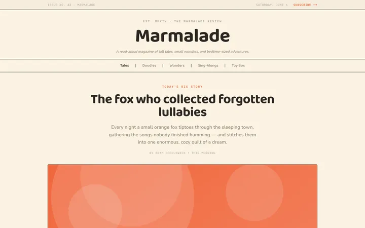
Fiction
Illustrates children's-book warmth with bold outlines and saturated color.

Arcade
Presses chunky pixel buttons and rainbow shadows into arcade-cabinet fun.
More from @staqd
View profileEditorial Pack
Collects the editorial cluster — typography-led, content-first pages in one install.
Design Systems Pack
Bundles every aesthetic design system in one install — switch styles per project.
Fiction
Illustrates children's-book warmth with bold outlines and saturated color.
Arcade
Presses chunky pixel buttons and rainbow shadows into arcade-cabinet fun.