Paper
Layers soft shadows and paper-like surfaces into calm, tactile reading interfaces.
- Version
- v1.0.0 · Updated Jul 18, 2026
- Context
- ≈1,285 tokens
- Security
- ✓ scanned
- License
- Single seat
- Works with
- Claude Code, Cursor, Codex
Checkout opens soon · launches at $9
≈1,285 tokens · v1.0.0
Live demo — an original page built in the Paper style. Open in new tab
About this skill
Paper design is a clean, tactile style inspired by real paper: soft shadows, subtle layering, and generous whitespace create depth while keeping the interface minimal, readable, and calm. Its live demo renders a magazine front page — masthead, lead story with pull quote, story grid, and newsletter signup.
The skill file
Paper treats the screen like a real desk with real sheets on it. Surfaces sit slightly above a warm, off-white canvas and cast soft, low shadows so the eye reads depth without ever feeling busy. The result is calm, tactile, and unmistakably editorial—a style built for words, reading, and unhurried attention. Reach for Paper when the content is the product: essays, documentation, journals, and any interface where you want the reader to forget the interface entirely.
Design principles
- Mimic physical paper: a warm canvas beneath, white sheets above, with shadow doing the work of separation instead of borders.
- Whitespace is structural, not decorative—generous margins and line spacing carry the hierarchy.
- One accent, used sparingly. Terracotta marks intent (links, active states, primary actions) and nothing else.
- Serif for voice, sans for utility: display headings feel printed, body and UI feel quiet.
- Shadows stay soft, low, and warm-tinted; never gray, never harsh, never floating too high.
- Restraint over ornament. If an element can be removed without losing meaning, remove it.
Color
The foundation is a warm off-white canvas (#FAF7F0) that reads like uncoated stock under soft light. Content sheets use pure #FFFFFF so they appear to rest just above the canvas, with separation created by shadow rather than the #E7E1D6 border, which is reserved for hairline dividers and inputs. Primary text is a near-black warm ink (#1C1B19) for high legibility without the starkness of true black; muted text (#7A746B) handles captions, metadata, and timestamps. The single accent is a terracotta (#C2410C) used for links, focus, and primary buttons.
For dark mode, invert toward ink rather than black: canvas #1A1916, sheets #23211D, foreground #F2EDE3, muted #A39C90, borders #34312B. Lighten the accent slightly to #E5703F so it holds contrast against dark surfaces. Keep shadows present but lower opacity (around 0.4) so layering survives in the dark.
- Typography
- Layout & spacing
- Components
- Motion
- Accessibility
- Use it with your AI tool
Preview ends here
Typography, Layout & spacing, Components, Motion, Accessibility & Use it with your AI tool unlock when checkout opens. Get notified
What's inside
- SKILL.md5.1 KB
More in Design
View allEditorial Pack
Collects the editorial cluster — typography-led, content-first pages in one install.
Design Systems Pack
Bundles every aesthetic design system in one install — switch styles per project.
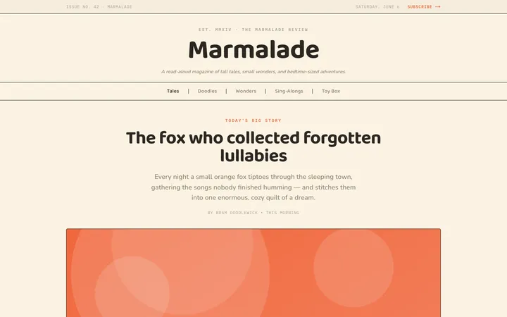
Fiction
Illustrates children's-book warmth with bold outlines and saturated color.

Arcade
Presses chunky pixel buttons and rainbow shadows into arcade-cabinet fun.
More from @staqd
View profileEditorial Pack
Collects the editorial cluster — typography-led, content-first pages in one install.
Design Systems Pack
Bundles every aesthetic design system in one install — switch styles per project.
Fiction
Illustrates children's-book warmth with bold outlines and saturated color.
Arcade
Presses chunky pixel buttons and rainbow shadows into arcade-cabinet fun.