Live demo — an original page built in the Primitive style. Open in new tab
Primitive
An unstyled-first, utility-driven foundation of accessible, composable building blocks you can theme into anything without fighting opinionated defaults.
Install via CLI
$ npx staqd add primitiveInside this skill
Primitive is a foundation, not a finish. It provides clean, composable, utility-first building blocks with sensible accessibility baked in and almost no decorative opinion — so you can layer your own brand on top without unpicking someone else's choices first. The aesthetic is a neutral grayscale with crisp geometry, designed to be re-themed in a single place via tokens. Reach for it when you're building a design system from scratch, shipping internal tooling, or want maximum control with minimum fight.
Design principles
- Unopinionated by default. Visual styling is minimal so it never gets in the way of your brand.
- Composable over monolithic. Every element is a small, predictable building block you can combine freely.
- Accessibility is not optional. Semantic HTML, ARIA, focus management, and keyboard support ship by default.
- Token-driven theming. Every color, radius, and spacing value is a CSS variable — change once, apply everywhere.
- Utility-first. Layout and spacing come from small composable utilities rather than bespoke component CSS.
- Predictable and boring on purpose. Consistency and clarity beat cleverness.
Primitive is a Pro skill
Unlock the full Primitive spec — design tokens, component coverage, motion, and accessibility — plus the entire library of design skills and Pro prompts.
- Every design skill, growing weekly
- Full Pro prompt library + unlimited MCP
- Commercial-use rights on output
Use it with these prompts
Form controls
FreeBuild a set of accessible form controls in the Primitive style: text input, select, checkbox, radio, and switch. Use neutral grayscale, 8px radius, clear focus rings, proper ARIA, and label associations. Keep it unopinionated and easy to theme.
Component kit
ProAdmin layout
ProMore aesthetic skills
Neumorphism
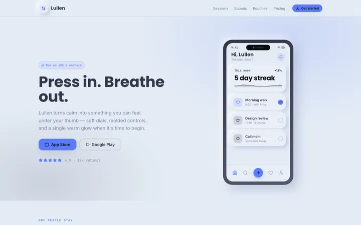
aestheticA soft, extruded interface where elements appear to push out of or press into a single continuous surface using paired light and dark shadows.
Artistic
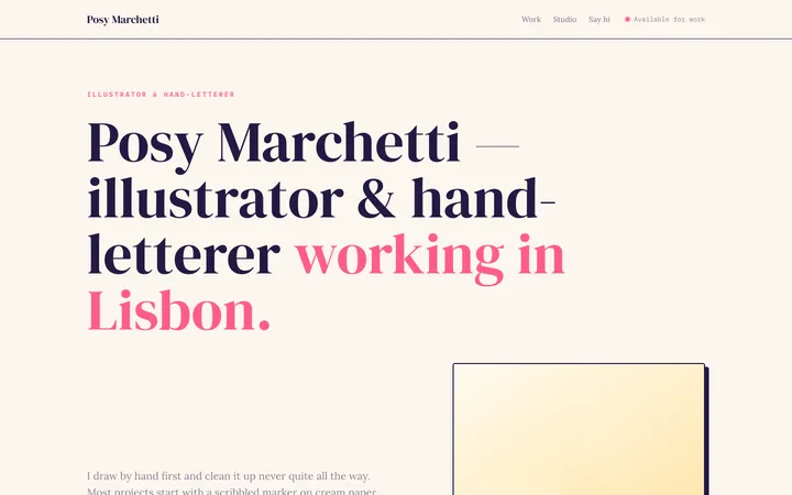
aestheticAn expressive, hand-made design system blending organic blobs, playful illustration, and unconventional layouts into interfaces that feel like a living sketchbook.
Perspective
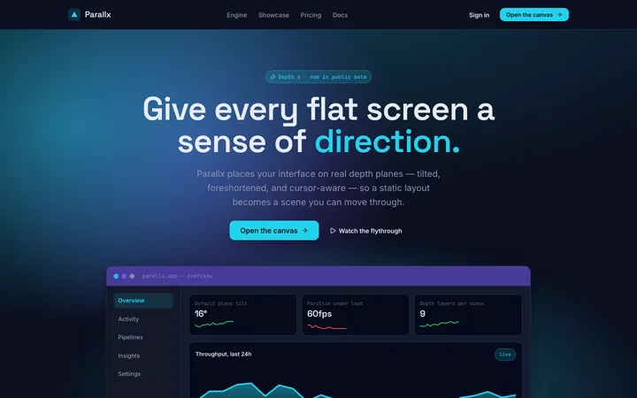
aestheticA spatial design system that uses angled planes, layered depth, and foreshortening to give flat screens a dynamic, three-dimensional sense of direction.