Live demo — an original page built in the Bento style. Open in new tab
Bento
A modular grid of card-like blocks with clear hierarchy and soft spacing that makes any content feel organized, scannable, and modern.
Install via CLI
$ npx staqd add bentoThe skill file
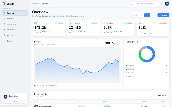
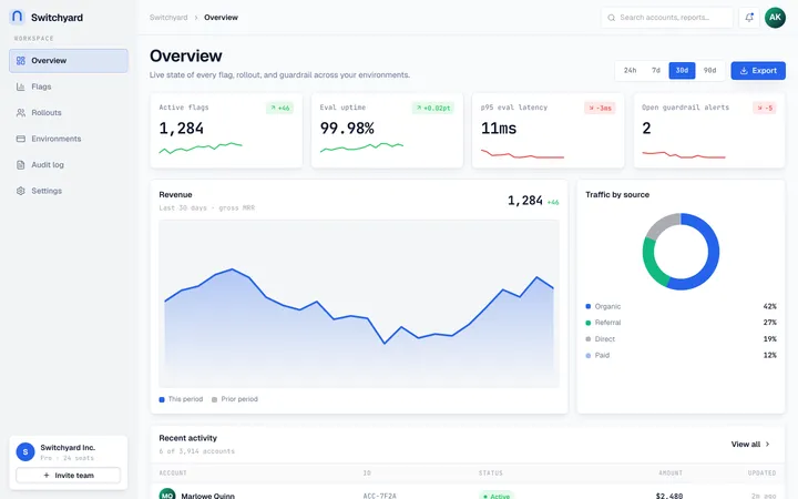
Bento arranges content the way a compartmented lunch box arranges a meal: distinct, rounded blocks of different sizes locked into one tidy grid, each holding a single idea. The varied tile sizes create instant hierarchy—big blocks lead, small blocks support—while consistent gaps and soft shadows keep everything feeling deliberate and calm. It is the fastest way to make a dense page read as organized and modern. Reach for Bento on feature sections, dashboards, and profile pages where many pieces of content need to coexist without clutter.
Design principles
- Compose the page from modular blocks of varied size; let the size of a tile express its importance.
- Keep gaps uniform and generous so the grid reads as one cohesive system, not scattered cards.
- One idea per tile—an icon, a heading, and a short supporting line is the canonical unit.
- Use asymmetry on purpose: mix one hero block with medium and small ones for visual rhythm.
- Soft, crisp shadows and rounded corners separate tiles from the canvas without heavy borders.
- Reserve the accent for the single most important number, label, or action inside a tile.
Color
Bento sits on a soft neutral gray canvas (#F4F4F6) so white tiles (#FFFFFF) pop forward cleanly. Separation comes from a crisp subtle shadow plus an optional 1px #E6E6EB border for extra definition on dense grids. Primary text is a near-black #16181D for sharp headings; muted text (#6B7280) carries labels, captions, and secondary lines. The accent indigo (#6D5BF8) is used surgically—one key metric, one primary button, or one highlighted "featured" tile per view—so it always means something. Avoid filling whole tiles with the accent except for a single intentional call-to-action block.
For dark mode, drop the canvas to #0E0F12 and tiles to #17191F, with foreground #F3F4F6, muted #9CA3AF, and borders #262931. Keep the same accent (#6D5BF8) or brighten slightly to #8273FF; reduce shadow opacity and let the lighter tile color carry separation against the dark canvas.
Typography
Headings use Geist (or Inter) at 600–700 with tight tracking (-0.02em) so tile titles feel confident and compact. Body uses Inter at 400/500. The scale is a major third (1.25): supporting text 14–15px, tile headings 18–20px, section headings 28–40px. Line-height runs 1.5 for body and 1.2 for headings. Inside tiles, keep copy short—type does double duty as both content and visual weight, so a single strong heading often beats a paragraph. Monospace (Geist Mono) suits large numeric metrics.
Layout & spacing
The heart of Bento is a responsive grid—commonly 12 columns on desktop—where tiles span different column and row counts (a hero might be 6x2, a stat tile 3x1). Gaps are consistent at 16–24px. Tile padding is 20–28px. On tablet, collapse to a simpler 6-column arrangement; on mobile, stack to a single column while preserving relative order and importance. Containers cap around 1200px and center. The discipline is uniform gaps and aligned edges: every tile snaps to the grid so nothing floats.
Components
- Tiles/cards: white blocks with a 16px radius and subtle shadow; on hover they lift 2px and the shadow deepens slightly.
- Buttons: primary is solid indigo with white text; secondary is a white tile-button with a hairline border and dark text.
- Inputs: white fields, 1px
#E6E6EBborder, 12px radius, focus ring in indigo at 30% opacity. - Navigation: a slim top bar above the grid; the active item gets an indigo underline or a soft filled pill.
- Modals/overlays: a centered rounded panel (matching tile radius) over a
rgba(16,18,21,0.4)scrim, scaling up gently on open. - Tables: when needed, render inside a tile with borderless rows and hairline dividers so the table reads as one bento block.
- Badges: small rounded pills in muted gray, or an accent-tinted pill for a single "featured" or "new" marker.
- Charts: live inside wide or tall tiles, using the accent for the primary series and grays for the rest.
Motion
Motion is light and snappy. Tile hover lifts run 160–200ms on ease-out (cubic-bezier(0.22, 1, 0.36, 1)) with a subtle shadow change. On page load, tiles can stagger in with a 40–60ms cascade of fade-plus-rise so the grid assembles itself. Modals scale from 0.96 to 1 with a fade over 180ms. Keep everything quick and grounded—no large bounces; the grid should feel responsive and precise, like compartments clicking into place.
Accessibility
Near-black text on white clears 14:1, and muted gray stays above 4.5:1 for body-sized copy. Indigo on white meets WCAG 2.2 AA for UI components and large text; keep accent text at 16px+ or bump weight. Never use the accent as the only signal for a featured tile—pair it with a label or icon. Each interactive tile gets a visible focus ring (2px indigo, 2px offset) and a real focusable element, not just a clickable div. Preserve logical reading order so a screen reader traverses tiles in their importance order even when the visual grid reflows. Honor prefers-reduced-motion by disabling the stagger and lift, keeping only instant or fade transitions. Maintain 44px minimum touch targets within tiles.
Use it with your AI tool
Paste this skill into your AI coding tool (Claude, Cursor, Codex), then prompt for the component you need. Install: npx staqd add bento
Use it with these prompts
Feature grid
FreeBuild a feature section in the Bento style: an asymmetric grid of rounded white blocks of varying sizes on a soft gray canvas, one large hero block, several medium and small blocks, each with an icon, short heading, and one line of supporting text.
Stats dashboard
ProProfile bento
ProMore layout skills
Dashboard
layoutA cloud-platform aesthetic of modular grids, glass-like panels, and crisp data hierarchy built for productivity dashboards that need to feel calm under heavy information.
Application
layoutA developer-first app shell with top-bar navigation, card-based panels, and dense, no-nonsense workflows built for getting things done.
Blocks
layoutA modular, grid-locked system of interlocking geometric panels in vibrant, high-contrast colors that snap together like a precise toy construction set.