Live demo — an original page built in the Ledger style. Open in new tab
Ledger
An enterprise-grade system tuned for data-dense screens—structured grids, precise tabular type, and quiet color that keeps thousands of rows readable.
Install via CLI
$ npx staqd add ledgerInside this skill
Ledger is built for the screens where data is the product—finance platforms, analytics suites, and enterprise grids that must stay legible at high density. It leans on a strict structural grid, precise tabular typography, and a restrained palette so that even a wall of numbers reads cleanly and predictably. Reach for it when consistency, scannability, and trust matter more than visual drama, and when every pixel of vertical space counts.
Design principles
- Data legibility above all: typography, alignment, and spacing are tuned for scanning, not browsing.
- Strict alignment: numbers right-align, labels left-align, and everything snaps to a tight baseline grid.
- Low chrome, high signal: minimal borders and shadows so content—not container—draws the eye.
- Predictable structure: consistent table, card, and toolbar patterns reduce cognitive load across screens.
- Status through quiet color: muted semantic accents flag state without turning the page into a rainbow.
- Tabular figures everywhere: monospaced numerics keep columns and totals perfectly aligned.
Ledger is a Pro skill
Unlock the full Ledger spec — design tokens, component coverage, motion, and accessibility — plus the entire library of design skills and Pro prompts.
- Every design skill, growing weekly
- Full Pro prompt library + unlimited MCP
- Commercial-use rights on output
Use it with these prompts
Data grid
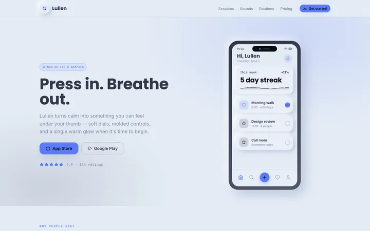
FreeBuild a Ledger data grid with a sticky header, right-aligned tabular-nums numeric columns, subtle row dividers, a frozen first column, inline status pills, and a totals row in teal—optimized for scanning hundreds of rows.
Financial dashboard
ProReconciliation view
ProMore aesthetic skills
Neumorphism
aestheticA soft, extruded interface where elements appear to push out of or press into a single continuous surface using paired light and dark shadows.
Artistic
aestheticAn expressive, hand-made design system blending organic blobs, playful illustration, and unconventional layouts into interfaces that feel like a living sketchbook.
Perspective
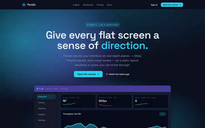
aestheticA spatial design system that uses angled planes, layered depth, and foreshortening to give flat screens a dynamic, three-dimensional sense of direction.