Gradient
Blends smooth color transitions into depth, energy, and instant focus.
- Version
- v1.0.0 · Updated Jul 18, 2026
- Context
- ≈1,429 tokens
- Security
- ✓ scanned
- License
- Single seat
- Works with
- Claude Code, Cursor, Codex
Checkout opens soon · launches at $9
≈1,429 tokens · v1.0.0
Live demo — an original page built in the Gradient style. Open in new tab
About this skill
Gradient design uses smooth color transitions to create depth, energy, and visual focus, giving interfaces a modern, vibrant feel without heavy visual clutter. Its live demo renders a product launch landing page — centered hero, feature showcase, pricing, and FAQ.
The skill file
Gradient is a vibrant, modern design language that uses smooth color transitions to add depth, motion, and focus. It pairs a deep indigo canvas with luminous violet-to-pink blends, frosted-glass surfaces, and soft ambient glows so interfaces feel energetic and contemporary without becoming busy. Reach for Gradient when a product wants to feel forward-looking and premium: AI and developer tools, modern SaaS, and creative or fintech apps that benefit from a sense of light and momentum.
Design principles
- Use gradients with intent. Blends should guide the eye, signal importance, and add depth, not decorate every surface.
- Anchor energy on a dark, neutral canvas so luminous color reads clearly and feels intentional.
- Keep a clean structure underneath the glow; layout and spacing stay disciplined so the look never feels chaotic.
- Reserve the brightest gradients for focal elements: primary CTAs, hero text, and featured cards.
- Layer translucency and soft glows to create atmosphere and a sense of light emanating from the interface.
- Maintain strong contrast for text so vibrancy never compromises legibility.
Color
The canvas is a deep indigo-black #0E0B1A, with surfaces on a slightly lifted #171232 that supports frosted-glass treatments. Foreground text is a soft near-white #F4F1FF, and muted copy uses lavender-gray #A39CC4. The signature gradient runs from the violet primary #7C5CFF to the pink secondary #FF5CA8, often as a linear blend (135deg) for buttons and text, or as soft radial and mesh glows in backgrounds. Borders are a low-key #2A2350, frequently replaced by a faint gradient stroke on featured elements. For light mode, use a #F4F1FF background with #FFFFFF glassy surfaces, #1A1530 foreground, and the same violet-to-pink gradient at slightly higher saturation so it stays vivid against white. Keep flat fills neutral so the gradient accents remain the star.
Typography
Headings use Sora (or a comparable geometric, modern sans) at 600-700 weights, set 32-72px with tight -0.02em tracking; hero headlines often use a clipped gradient text fill from violet to pink. Body copy uses Inter at 400-500, 16-18px, with a 1.65 line-height for easy reading on dark surfaces. The type scale follows a clean major-third ratio (1.25) for balanced, modern steps. Keep gradient text limited to a few high-impact words so it stays special and remains legible. The mono stack suits code snippets, version tags, and technical labels.
- Layout & spacing
- Components
- Motion
- Accessibility
- Use it with your AI tool
Preview ends here
Layout & spacing, Components, Motion, Accessibility & Use it with your AI tool unlock when checkout opens. Get notified
What's inside
- SKILL.md5.7 KB
More in Design
View allEditorial Pack
Collects the editorial cluster — typography-led, content-first pages in one install.
Design Systems Pack
Bundles every aesthetic design system in one install — switch styles per project.
Fiction
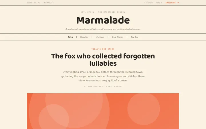
Illustrates children's-book warmth with bold outlines and saturated color.

Arcade
Presses chunky pixel buttons and rainbow shadows into arcade-cabinet fun.
More from @staqd
View profileEditorial Pack
Collects the editorial cluster — typography-led, content-first pages in one install.
Design Systems Pack
Bundles every aesthetic design system in one install — switch styles per project.
Fiction
Illustrates children's-book warmth with bold outlines and saturated color.
Arcade
Presses chunky pixel buttons and rainbow shadows into arcade-cabinet fun.