Energetic
Accelerates the page with vivid color, dynamic shapes, and constant motion.
- Version
- v1.0.0 · Updated Jul 18, 2026
- Context
- ≈2,710 tokens
- Security
- ✓ scanned
- License
- Single seat
- Works with
- Claude Code, Cursor, Codex
Checkout opens soon · launches at $9
≈2,710 tokens · v1.0.0
Live demo — an original page built in the Energetic style. Open in new tab
About this skill
Energetic design is bold and fast-paced, using vivid colors, dynamic shapes, and strong visual movement to create a lively, action-oriented experience. Its live demo renders a mobile app landing page — phone mockups, feature tiles, mini charts, and app-store CTAs.
The skill file
Energetic is a design system tuned for momentum. It pairs a deep indigo stage with vivid orange, pink, purple, and cyan gradients, bold italic display type, diagonal cuts, and glowing colored shadows so everything feels like it is leaning forward and about to move. Reach for Energetic when the goal is hype and adrenaline — fitness and sports brands, product launches, music and event pages, and any audience that responds to speed, color, and confidence. The whole language is engineered so that even a static screenshot reads as a freeze-frame of something in motion.
Design principles
- Imply motion even at rest: diagonals, tilts, and gradients give the eye a direction to travel.
- Color is high-octane — vivid gradients and saturated accents, never muted or pastel.
- Glow over flatness: shadows take the accent hue so elements feel lit from within and forward-leaning.
- Bold, expressive type with italics and gradient highlights to set an urgent pace.
- Rounded, confident shapes — generous radii that feel friendly but punchy.
- Rhythm and contrast: alternate dark bands with bright accent moments to keep momentum building.
- Lead with one hero gradient and let everything else support it, so the energy has a focal point.
Color
The stage is a deep indigo background (#0E0B1A) with raised surfaces in #1A1530 and borders in #2E2750, letting saturated color leap forward off the dark field. Foreground text is white (#FFFFFF) with muted lavender (#A89FC4) for secondary copy. The signature is a gradient family: primary orange (#FF5722) flowing into hot pink (#FF1F8E), supported by electric purple (#7C3AED), cyan (#00C2FF), and a high-voltage yellow (#FFE600) for highlights. Gradients typically run on a 135-degree diagonal to reinforce forward motion rather than sitting flat.
The system is dark-first because the glows read brightest against the indigo stage. A light "daytime" variant uses a white #FFFFFF background with #0E0B1A text while keeping the same neon gradients as accents — useful when a brand needs a brighter face — but the dark stage is canonical. Keep saturation high throughout; the moment colors drift toward pastel, the energy drains. Reserve the yellow strictly for small high-voltage highlights so it never competes with the orange-to-pink hero gradient.
Token reference
background#0E0B1A— the deep indigo stage that makes color leap.surface#1A1530— raised cards, panels, and floating bars.primary#FF5722— the orange anchor of the hero gradient and CTAs.secondary#FF1F8E— hot pink, the other end of the signature gradient.foreground#FFFFFF— primary white text against the dark stage.muted#A89FC4— lavender secondary copy and captions.border#2E2750— subtle surface outlines before a glow takes over.
- Typography
- Layout & spacing
- Components
- Motion
- Responsive behavior
- Accessibility
- Use it with your AI tool
Preview ends here
Typography, Layout & spacing, Components, Motion, Responsive behavior, Accessibility & Use it with your AI tool unlock when checkout opens. Get notified
What's inside
- SKILL.md11 KB
More in Design
View allEditorial Pack
Collects the editorial cluster — typography-led, content-first pages in one install.
Design Systems Pack
Bundles every aesthetic design system in one install — switch styles per project.
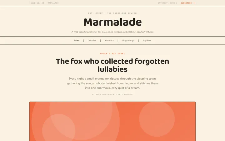
Fiction
Illustrates children's-book warmth with bold outlines and saturated color.

Arcade
Presses chunky pixel buttons and rainbow shadows into arcade-cabinet fun.
More from @staqd
View profileEditorial Pack
Collects the editorial cluster — typography-led, content-first pages in one install.
Design Systems Pack
Bundles every aesthetic design system in one install — switch styles per project.
Fiction
Illustrates children's-book warmth with bold outlines and saturated color.
Arcade
Presses chunky pixel buttons and rainbow shadows into arcade-cabinet fun.