Riso
Prints joyful two-color pages with fluorescent pink and offset shadows.
- Version
- v1.0.0 · Updated Jul 18, 2026
- Context
- ≈1,317 tokens
- Security
- ✓ scanned
- License
- Single seat
- Works with
- Claude Code, Cursor, Codex
Checkout opens soon · launches at $9
≈1,317 tokens · v1.0.0
Live demo — an original page built in the Riso style. Open in new tab
About this skill
Riso design is a joyful two-color print style with warm off-white paper, fluorescent pink interactions, federal-blue headings, and playful offset risograph shadows. Its live demo renders a personal portfolio — intro, selected work, about, and contact.
The skill file
Riso is a celebration of the duplicator press: bright, low-fidelity, and unapologetically printed. It mimics the look of running a page through a stencil machine twice, once for federal blue and once for fluorescent pink, on warm recycled paper. The result feels handmade and a little imperfect in the best way, with hard offset shadows standing in for the slight registration drift of real two-color printing. Reach for Riso when you want energy, craft, and personality over corporate polish.
Design principles
- Commit to a strict two-ink palette: federal blue for structure and fluorescent pink for life, plus paper and near-black ink.
- Embrace flatness. Shadows are hard offset blocks, never blurred gradients, echoing misregistered print layers.
- Let type be loud. Oversized headings carry the page; supporting copy stays calm.
- Introduce intentional imperfection: tiny rotations, halftone textures, and overprint blends.
- Keep corners crisp and nearly square so elements read like stamped ink blocks.
- Use whitespace generously so the bright inks never feel muddy.
Color
The canvas is warm paper #FBF6EC with a slightly deeper panel surface #F4E9D6, so layered cards feel like a second sheet. Ink is #1A1A1A, never pure black, to match the softness of real printing. Federal blue #0B3D91 does structural work: borders, headings, table rules, and shadows. Fluorescent pink #FF48B0 is the primary action color and the spark of the system, used for buttons, links, highlights, and key stats. Muted text uses #7A6F5C, a faded sepia that sits naturally on cream. For overprint moments, blend pink and blue at partial opacity to suggest a purple where the inks overlap. In dark mode, invert to a deep ink ground #161310 with paper-cream text, keeping pink at full saturation and lifting blue toward #5B8DEF so it stays legible on dark.
Typography
Headings use Space Grotesk, a geometric grotesque with character, at heavy weights (600–700) and tight tracking (-0.02em) so big titles feel set in metal. Body copy is Inter at 1rem with a comfortable 1.65 line-height for readable zine-length text. Monospace details and captions use Space Mono to reinforce the printed-ephemera feel. Labels, eyebrows, and nav items are uppercase with +0.08em tracking. The scale is dramatic: hero headings clamp between 2rem and 4rem, with clear steps down so hierarchy reads instantly.
- Layout & spacing
- Components
- Motion
- Accessibility
- Use it with your AI tool
Preview ends here
Layout & spacing, Components, Motion, Accessibility & Use it with your AI tool unlock when checkout opens. Get notified
What's inside
- SKILL.md5.2 KB
More in Design
View allEditorial Pack
Collects the editorial cluster — typography-led, content-first pages in one install.
Design Systems Pack
Bundles every aesthetic design system in one install — switch styles per project.
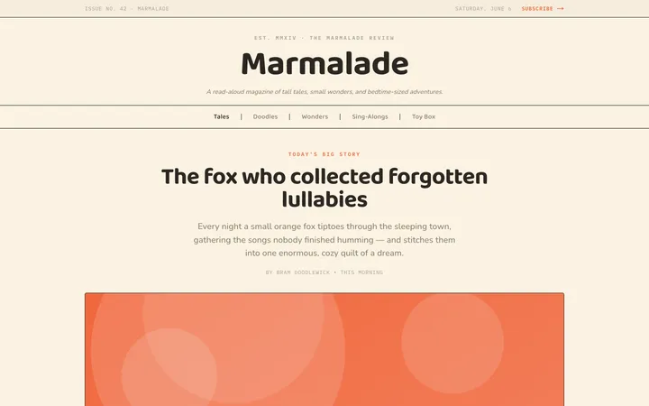
Fiction
Illustrates children's-book warmth with bold outlines and saturated color.

Arcade
Presses chunky pixel buttons and rainbow shadows into arcade-cabinet fun.
More from @staqd
View profileEditorial Pack
Collects the editorial cluster — typography-led, content-first pages in one install.
Design Systems Pack
Bundles every aesthetic design system in one install — switch styles per project.
Fiction
Illustrates children's-book warmth with bold outlines and saturated color.
Arcade
Presses chunky pixel buttons and rainbow shadows into arcade-cabinet fun.