Live demo — an original page built in the Neobrutalism style. Open in new tab
Neobrutalism
A loud, high-contrast look built from chunky shapes, hard black edges, and unapologetically blocky color that refuses to whisper.
Install via CLI
$ npx staqd add neobrutalismThe skill file
Neobrutalism takes the bones of an interface and puts them on display. Thick black outlines, flat saturated color, and hard shadows with no blur create a look that feels printed rather than rendered. It is playful, confident, and a little defiant — the kind of style you reach for when blending in is the enemy. Use it for products that want personality, launches that need to be remembered, and anyone tired of soft gradients and timid gray. The whole system reads like a well-made poster: bold blocks, honest structure, and zero pretense of polish.
Design principles
- Outline everything: a consistent 2-3px near-black border defines every surface, button, and input.
- Replace blur with offset: shadows are solid color blocks pushed down-and-right, never soft.
- Use color in large flat blocks — no gradients, no tints, no opacity tricks.
- Keep geometry blunt: small or zero radius, rectangular layouts, obvious grid lines.
- Make interaction physical: pressing a button moves it into its own shadow.
- Embrace asymmetry and oversized type; whitespace is structural, not decorative.
- Let the system feel hand-assembled — slight intentional misalignment reads as charm, not error.
Color
The canvas is a warm off-white #FFFDF5 so the black ink reads as ink, not pure digital black. Surfaces sit on pure #FFFFFF to pop off the canvas. The primary action color is a hot orange #FF5C00, with a confident blue #2563FF as secondary and a mint #00E0A4 for success and accents. Foreground text and all borders share the same #111111, which is the structural backbone of the whole system. Muted supporting text uses #6B6B6B.
Use the bright swatches (#FFE600, #FF5C00, #2563FF, #00E0A4) as full-bleed background blocks rather than as subtle highlights. A neobrutalist screen often divides into a few large flat color fields, each bordered and shadowed, like cut paper laid on a desk. Avoid mixing more than three saturated colors in a single view, or the energy tips into noise. Pair every bright fill with near-black text or borders so the contrast stays brutal and legible.
For a dark variant, flip the canvas to #111111, keep borders and shadows in #FFFDF5, and let the saturated swatches glow against the dark. Inverting the ink rather than dimming the palette preserves the style's signature hard-edged punch; the colors stay just as loud, they simply sit on black instead of cream.
Typography
Headings use a wide, sturdy grotesque (Archivo) at 700-900 weight with tracking pulled in to -0.02em so words feel like solid masses. Body copy runs in a clean neutral sans (Inter) at 400-500 with a 1.5 line-height for comfortable reading against the busy borders. Mono (IBM Plex Mono) appears in labels, tags, badges, and data, often set in uppercase to feel stamped.
Lean on a steep 1.333 type scale so the jump from body to headline is dramatic — neobrutalism wants size contrast, not subtlety. Set hero headlines enormous (clamp them up to 72-96px on desktop) and let them wrap onto two or three short lines for a blocky, stacked silhouette. Eyebrow labels and metadata go uppercase in mono with +0.06em tracking. Avoid thin weights entirely; everything here should feel heavy, deliberate, and a little oversized.
Layout & spacing
Work on an 8px base grid with generous gaps so heavy borders have room to breathe. Containers cap around 1200px but content blocks are encouraged to break alignment intentionally — a card that hangs slightly past the column edge reads as charm here, not error. Density is medium-low: padding inside cards is bold (24-32px). Let big empty color fields carry layout weight rather than filling every region.
Favor obvious, modular grids — two, three, or four equal blocks — over clever fluid arrangements. Sticker-like accents (a rotated badge, an arrow, an underline scribble) can be dropped in to break the grid and add playfulness, but keep them bordered and flat so they belong to the system. The overall composition should feel like it was laid out with scissors and a ruler.
Components
- Buttons: solid fill, 3px
#111111border,4px 4px 0 #111111shadow; on hover translate 1px up-left, on press translate to (4px,4px) so it sinks into its shadow. - Inputs: white field, 3px black border, square corners, bold placeholder; focus swaps border to the accent color and adds a hard shadow.
- Cards: white surface, thick border, hard offset shadow, optional blocky color header strip across the top.
- Navigation: bordered bar with chunky text links; active item gets a flat color underline block, not a thin rule.
- Modals/overlays: a bordered white panel dropped onto a flat semi-opaque
#111111scrim; the panel keeps its hard shadow and square corners. - Tables: every cell bordered, header row in a flat swatch color, zebra striping with
#FFFDF5, no soft alternating tints. - Badges/tags: small flat color rectangles with black borders and uppercase mono labels, often slightly rotated.
- Toggles and checkboxes: square, bordered, filled with accent color when active; the check itself is a thick black mark.
- Alerts: full-color bordered banners with a bold icon block on the left and heavy headline text.
Motion
Motion is snappy and mechanical. Transitions run 80-120ms with a near-linear or ease-out curve — nothing floaty. The signature move is the press: an element translates toward its shadow so the shadow shrinks to zero, mimicking a physical button. Hover states nudge elements up-left by 1-2px to suggest they are about to be pressed, growing the shadow slightly to imply lift.
Avoid fades and scale-bloom; keep everything crisp and instant. When something enters the screen, let it pop in or slide in hard rather than gently fade. A small, optional flourish — a badge that rotates a few degrees on hover, or a marquee strip of mono text — fits the playful spirit without softening the edges.
Accessibility
The black-on-color and black-on-white combinations easily clear WCAG 2.2 AA, but always verify color-on-color pairings (for example, white text on #FF5C00 is borderline — prefer #111111 text on bright fills). Focus states are unmissable by design: a thick accent border plus hard shadow doubles as a visible focus signal, but still add a distinct :focus-visible treatment for keyboard users so it is never ambiguous which control is active.
Honor prefers-reduced-motion by removing the press-translate and shadow-grow effects and using instant state changes instead. Never rely on color alone to signal meaning — the borders and labels already carry it, so reinforce status with text or icons. Keep body text at a minimum 16px despite the loud aesthetic, and ensure interactive targets are at least 44px so the chunky styling stays comfortably tappable.
Use it with your AI tool
Paste this skill into your AI coding tool (Claude, Cursor, Codex), then prompt for the component you need. Install: npx staqd add neobrutalism
Use it with these prompts
Landing hero
FreeBuild a landing page hero in the Neobrutalism style: a chunky off-white canvas, an oversized 900-weight headline in near-black, a bright orange primary button with a hard 4px black border and a 6px solid drop shadow, plus a flat sticker-like badge above the headline.
Pricing cards
ProDashboard shell
ProMore aesthetic skills
Neumorphism
aestheticA soft, extruded interface where elements appear to push out of or press into a single continuous surface using paired light and dark shadows.
Artistic
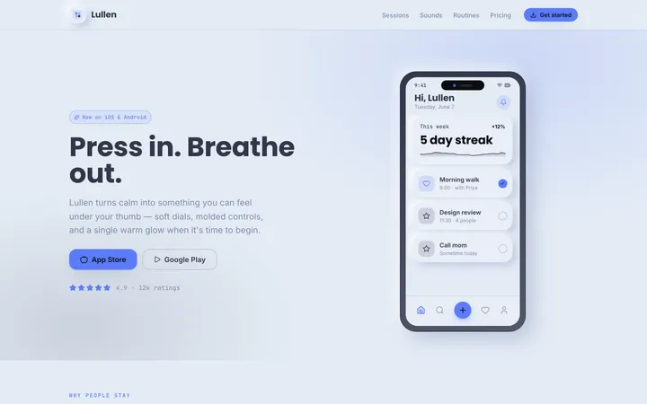
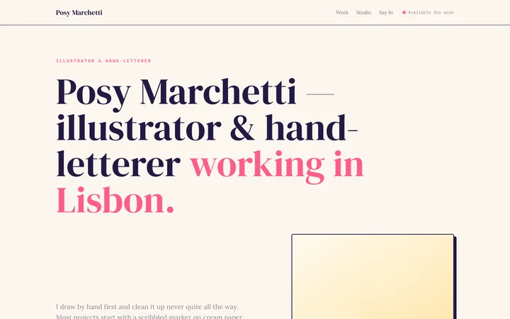
aestheticAn expressive, hand-made design system blending organic blobs, playful illustration, and unconventional layouts into interfaces that feel like a living sketchbook.
Perspective
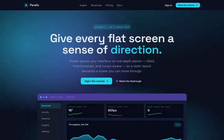
aestheticA spatial design system that uses angled planes, layered depth, and foreshortening to give flat screens a dynamic, three-dimensional sense of direction.