Modern
Tracks current UI trends — soft shadows, rounded corners, clean surfaces.
- Version
- v1.0.0 · Updated Jul 18, 2026
- Context
- ≈1,694 tokens
- Security
- ✓ scanned
- License
- Single seat
- Works with
- Claude Code, Cursor, Codex
Checkout opens soon · launches at $9
≈1,694 tokens · v1.0.0
Live demo — an original page built in the Modern style. Open in new tab
About this skill
A contemporary design system following the latest UI trends, featuring soft shadows, rounded corners, and clean interfaces. Its live demo renders a SaaS landing page — hero, bento feature grid, stats band, pricing, and testimonials.
The skill file
Modern is a calm, contemporary design language tuned to how the best web products look today: soft layered shadows, gently rounded corners, restrained neutral palettes, and a single confident accent. It feels light, trustworthy, and effortless — the kind of interface that disappears so the content and workflow take center stage. Reach for it when building SaaS apps, dashboards, and startup sites that need to feel polished and current without shouting.
Design principles
- Quiet by default, loud only where it counts. One accent color does the heavy lifting; everything else is neutral.
- Depth through softness. Elevation comes from soft, multi-layer shadows rather than hard borders or harsh drop shadows.
- Comfortable density. Generous but not wasteful spacing keeps interfaces scannable and unhurried.
- Consistent rounding. A shared 12px radius across cards, inputs, and buttons creates visual cohesion.
- Content first. Typography and layout prioritize legibility and hierarchy over decoration.
- Equally crisp in light and dark. The system is designed for both modes from the start.
Color
The base is a clean white #FFFFFF background with a cool #F8FAFC surface for cards and panels, giving a subtle separation without borders. The primary action color is a deep indigo #4F46E5, supported by a sky blue secondary #0EA5E9 and an emerald #10B981 for success and positive states. Foreground text uses near-black slate #0F172A, muted text and icons sit at #64748B, and hairline borders are #E2E8F0.
Light-mode token reference:
- Background
#FFFFFF, Surface#F8FAFC, raised surface#FFFFFF. - Primary
#4F46E5, Primary hover#4338CA, Primary pressed#3730A3. - Secondary
#0EA5E9, Success#10B981, Warning#F59E0B, Danger#EF4444. - Foreground
#0F172A, Muted#64748B, Border#E2E8F0, Focus ring#4F46E5.
In dark mode, set the background to #0B1120, surfaces to #111827, lift foreground to #F1F5F9, soften muted text to #94A3B8, and use #1E293B borders. The indigo primary brightens slightly to #6366F1 so it holds contrast on dark surfaces. Shadows in dark mode become near-invisible; rely on surface elevation and subtle borders instead.
Dark-mode token reference:
- Background
#0B1120, Surface#111827, Border#1E293B. - Primary
#6366F1, Secondary#38BDF8, Success#34D399, Danger#F87171. - Foreground
#F1F5F9, Muted#94A3B8.
Elevation tokens: shadow-sm = 0 1px 2px rgba(15,23,42,0.06); shadow-md = 0 4px 12px rgba(15,23,42,0.08); shadow-lg = 0 12px 32px rgba(15,23,42,0.12). Use one consistent step per elevation level so the interface stays calm.
- Typography
- Layout & spacing
- Components
- Motion
- Accessibility
- Use it with your AI tool
Preview ends here
Typography, Layout & spacing, Components, Motion, Accessibility & Use it with your AI tool unlock when checkout opens. Get notified
What's inside
- SKILL.md6.7 KB
More in Design
View allEditorial Pack
Collects the editorial cluster — typography-led, content-first pages in one install.
Design Systems Pack
Bundles every aesthetic design system in one install — switch styles per project.
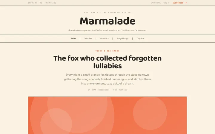
Fiction
Illustrates children's-book warmth with bold outlines and saturated color.

Arcade
Presses chunky pixel buttons and rainbow shadows into arcade-cabinet fun.
More from @staqd
View profileEditorial Pack
Collects the editorial cluster — typography-led, content-first pages in one install.
Design Systems Pack
Bundles every aesthetic design system in one install — switch styles per project.
Fiction
Illustrates children's-book warmth with bold outlines and saturated color.
Arcade
Presses chunky pixel buttons and rainbow shadows into arcade-cabinet fun.