Expressive
Amplifies brand personality through rich contrast and creative typography.
- Version
- v1.0.0 · Updated Jul 18, 2026
- Context
- ≈1,356 tokens
- Security
- ✓ scanned
- License
- Single seat
- Works with
- Claude Code, Cursor, Codex
Checkout opens soon · launches at $9
≈1,356 tokens · v1.0.0
Live demo — an original page built in the Expressive style. Open in new tab
About this skill
Expressive design is bold and personality-driven, using distinctive visuals, rich contrast, and creative typography to communicate emotion and brand character. Its live demo renders an agency portfolio — hero, selected-work grid, services, and contact CTA.
The skill file
Expressive is a loud, joyful design language that wears its personality on its sleeve. It combines a warm cream canvas, punchy pink and violet accents, chunky bordered shapes, and bold display type to create interfaces that feel handmade, confident, and full of character. Reach for Expressive when a brand wants to stand out and feel human: indie products, creative tools, community apps, and campaigns that should spark a smile.
Design principles
- Lead with personality. Bold type, vivid color, and playful shapes are features, not decoration.
- Use thick borders and solid offset shadows to give every element a tactile, sticker-like presence.
- Mix and contrast: pair pink with violet, large with small, rounded with chunky, to keep energy high.
- Embrace asymmetry and slight imperfection; a little tilt or overlap makes things feel alive.
- Keep readability intact under all the energy by anchoring on a warm neutral and a dark ink color.
- Make interactions feel fun and responsive, with springy, tactile feedback.
Color
The canvas is a warm cream #FFF8F0 that feels friendly and analog, with crisp #FFFFFF surfaces for cards. The ink color for text and borders is a deep blue-violet near-black #1A1430, which is softer and more characterful than pure black. The two accents do the heavy lifting: a hot pink primary #FF4D7D and an electric violet secondary #7C3AED, used boldly for buttons, highlights, and accent fills. Muted supporting text uses #6B6480. Borders are intentionally bold and dark, using the ink #1A1430 at full weight. For dark mode, move to a #1A1430 background, #241B40 surfaces, #FFF8F0 foreground, and keep both accents bright so the energy survives the switch. Color should feel deliberate and confident, never washed out.
Typography
Headings use Clash Display (or a similar bold, characterful display face) at 600-700 weights, set large at 56-104px with tight -0.02em tracking. Mixing weights and even highlighting single words in an accent color is encouraged. Body copy uses Plus Jakarta Sans at 400-500, 16-18px, with a 1.6 line-height for comfortable reading. The type scale uses a punchy 1.4 ratio so the contrast between display and body is dramatic and energetic. The mono stack (Space Mono) is great for labels, tags, and small accents that add a quirky, technical contrast.
- Layout & spacing
- Components
- Motion
- Accessibility
- Use it with your AI tool
Preview ends here
Layout & spacing, Components, Motion, Accessibility & Use it with your AI tool unlock when checkout opens. Get notified
What's inside
- SKILL.md5.4 KB
More in Design
View allEditorial Pack
Collects the editorial cluster — typography-led, content-first pages in one install.
Design Systems Pack
Bundles every aesthetic design system in one install — switch styles per project.
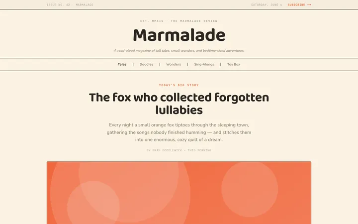
Fiction
Illustrates children's-book warmth with bold outlines and saturated color.

Arcade
Presses chunky pixel buttons and rainbow shadows into arcade-cabinet fun.
More from @staqd
View profileEditorial Pack
Collects the editorial cluster — typography-led, content-first pages in one install.
Design Systems Pack
Bundles every aesthetic design system in one install — switch styles per project.
Fiction
Illustrates children's-book warmth with bold outlines and saturated color.
Arcade
Presses chunky pixel buttons and rainbow shadows into arcade-cabinet fun.