Simple
Reduces every screen to its essentials for instantly intuitive use.
- Version
- v1.0.0 · Updated Jul 18, 2026
- Context
- ≈1,263 tokens
- Security
- ✓ scanned
- License
- Single seat
- Works with
- Claude Code, Cursor, Codex
Checkout opens soon · launches at $9
≈1,263 tokens · v1.0.0
Live demo — an original page built in the Simple style. Open in new tab
About this skill
A minimalist design system focused on clarity, essential UI elements, and highly intuitive user experiences. Its live demo renders a SaaS marketing landing page — hero, onboarding steps, pricing table, FAQ, and testimonials.
The skill file
Simple is an interface language of subtraction. Every element earns its place; if it does not help the user decide or act, it is removed. The result feels quiet, confident, and fast — the kind of screen where you never wonder what to click next. Reach for Simple when clarity matters more than personality, and when you want the content, not the chrome, to be the experience.
Design principles
- Default to nothing. Add an element only when its absence would confuse the user.
- One primary action per view; everything else is secondary or text-only.
- Hierarchy comes from spacing and weight, not from color, borders, or shadows.
- Use a single accent color and use it sparingly, so it always reads as "do this."
- Keep copy short and literal — labels over jargon, verbs over nouns.
- Align everything to one column or one grid; no decorative asymmetry.
Color
The palette is deliberately tiny. The canvas is pure white (#FFFFFF) with a barely-there surface tint (#F9FAFB) to lift cards and panels off the page. Text is near-black (#111827) for maximum legibility, with muted gray (#6B7280) reserved for secondary captions and helper text. The lone accent is a calm, trustworthy blue (#2563EB) used only for primary buttons, active states, and links. Borders are a single hairline gray (#E5E7EB). In dark mode, invert the canvas to a soft near-black (#0B0F19), surfaces to #151A24, foreground to #F3F4F6, muted to #9CA3AF, and brighten the accent to #3B82F6 so it keeps its prominence against the darker field. Never introduce a second accent; if you need to signal danger, borrow a restrained red (#DC2626) and nothing more.
Typography
One typeface does all the work. Inter (or a neutral system sans fallback) carries headings and body alike, so the page reads as a single voice. Hierarchy is built from just two weights — 400 for body, 600 for headings and emphasis — plus a compact minor-third scale (roughly 14 / 16 / 20 / 24 / 32 px). Headings tighten tracking slightly to -0.01em; body sits at 0em for comfortable reading. Line-height is 1.5 for body text and 1.25 for headings. Monospace (IBM Plex Mono) appears only for code, keys, and identifiers.
- Layout & spacing
- Components
- Motion
- Accessibility
- Use it with your AI tool
Preview ends here
Layout & spacing, Components, Motion, Accessibility & Use it with your AI tool unlock when checkout opens. Get notified
What's inside
- SKILL.md5.0 KB
More in Design
View allEditorial Pack
Collects the editorial cluster — typography-led, content-first pages in one install.
Design Systems Pack
Bundles every aesthetic design system in one install — switch styles per project.
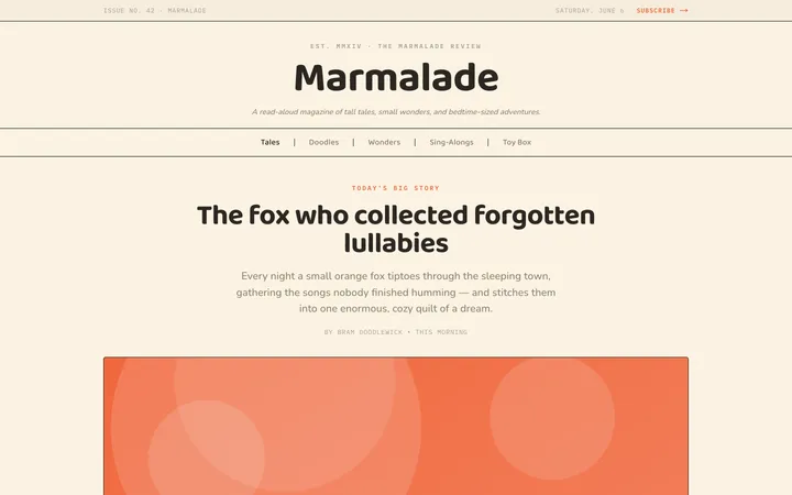
Fiction
Illustrates children's-book warmth with bold outlines and saturated color.

Arcade
Presses chunky pixel buttons and rainbow shadows into arcade-cabinet fun.
More from @staqd
View profileEditorial Pack
Collects the editorial cluster — typography-led, content-first pages in one install.
Design Systems Pack
Bundles every aesthetic design system in one install — switch styles per project.
Fiction
Illustrates children's-book warmth with bold outlines and saturated color.
Arcade
Presses chunky pixel buttons and rainbow shadows into arcade-cabinet fun.