Live demo — an original page built in the Dashboard style. Open in new tab
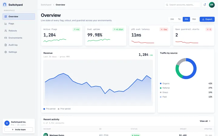
Dashboard
A cloud-platform aesthetic of modular grids, glass-like panels, and crisp data hierarchy built for productivity dashboards that need to feel calm under heavy information.
Install via CLI
$ npx staqd add dashboardThe skill file
Dashboard is a design system tuned for density without anxiety. It borrows the calm, modular feel of a modern cloud console: clean white panels floating on a soft blue-gray field, layered soft shadows, a confident blue accent, and a strict data hierarchy that lets numbers lead. Reach for Dashboard whenever you are building productivity surfaces — analytics, admin consoles, internal tools, billing portals — where users scan a lot of information at once and need structure more than spectacle. The whole language is built so that a screen packed with metrics still feels orderly and quiet.
Design principles
- Hierarchy is everything: size, weight, and color guide the eye from headline metric to supporting detail in a single glance.
- Panels are modular tiles on a consistent grid; the layout should feel composable and rearrangeable, like a board of widgets.
- Color is functional — blue for primary actions and selection, green/amber/red strictly for status, never for decoration.
- Numbers get tabular figures so columns align and metrics read like a clean ledger.
- Depth is gentle: soft layered shadows and faint hairline borders separate planes without shouting.
- Calm density — pack information tightly but keep a consistent rhythm so nothing ever feels cramped.
- Every state is designed: loading, empty, and error views get the same care as the happy path.
Color
The canvas is a soft blue-gray (#F6F8FB) so white panels (#FFFFFF) read as floating tiles rather than flat regions. Foreground text is deep slate #0F172A, with muted secondary text in #64748B for labels and metadata, and hairline borders in #E2E8F0. The primary accent is a clear platform blue (#3B82F6) for buttons, active navigation, links, and selection; a violet secondary (#6366F1) supports chart series and selected states. Status is a fixed, learnable vocabulary: green #22C55E for healthy and positive, amber #F59E0B for warning and pending, red #EF4444 for error and negative.
Keep the field neutral and let blue do the pointing — accent should appear only where the user can act or where something needs attention. In dark mode, shift to a deep navy canvas (#0B1220) with raised surfaces in #111A2E, foreground #F8FAFC, and borders #1E293B; brighten the blue slightly to #60A5FA so it holds against the dark, and give glass panels a faint 1px white inner border so their edges stay legible. Status hues stay constant across themes so the color code never has to be relearned.
Token reference
background#F6F8FB— the soft blue-gray field that makes panels float.surface#FFFFFF— cards, tables, modals, and any raised tile.primary#3B82F6— primary buttons, active nav, links, selection.secondary#6366F1— chart accents and selected/secondary states.foreground#0F172A— headings, body, and metric numbers.muted#64748B— labels, captions, timestamps, low-emphasis text.border#E2E8F0— hairline dividers, card outlines, input borders.
Typography
Inter carries both headings and body for a clean, neutral UI voice; headings run 600 weight with -0.01em tracking, body at 400/500. JetBrains Mono handles IDs, code, API keys, and any value that benefits from a monospaced grid. Crucially, enable tabular (lining) numerals on every metric and table column so figures align vertically and changes are easy to scan. The scale is tight and functional (minor third, 1.2): supporting text 13px, body 14px, subheads 16px, section titles 20px, page titles 24px. Line-height stays compact at 1.45 for dense data, loosening to 1.6 only in long-form help text and documentation.
Resist the urge to inflate type — in a dense console, restraint reads as confidence. Use weight and color, not size, to establish most of the hierarchy: a 600-weight slate label over a muted 14px caption does more than a large heading. Reserve the 24px page title for the single top-level heading per view, and keep section headers at 16–20px so the layout stays flat and scannable.
Layout & spacing
A 12-column responsive grid drives the content area, paired with a fixed 240px left sidebar that collapses to a 64px icon rail. Spacing uses a 4px base scale (4 / 8 / 12 / 16 / 24 / 32) for fine control in dense layouts. Cards align to consistent gutters (16–24px) so tiles form a clean mosaic, and every panel shares the same internal padding (16–20px) so the grid reads as one system. Container width is fluid up to about 1440px, with content padded 24px from the rail. A subtle sticky top bar holds global search, an environment switcher, and the account menu.
Do
- Align stat cards to a strict gutter so the grid reads as a single composed surface.
- Right-align numeric table columns and turn on tabular figures everywhere numbers appear.
- Use the icon rail at narrow widths so the dashboard stays usable on smaller screens.
Don't
- Don't mix more than one accent blue with status colors in the same panel — it muddies meaning.
- Don't drop hard shadows or heavy borders; depth here is soft and layered, never crisp.
- Don't let a single dense table run full-bleed without a containing surface card.
Components
- Buttons: 10px radius, blue primary with white label and a faint shadow; secondary is white with a slate border; ghost buttons for low-emphasis row actions.
- Inputs: white field, 1px
#E2E8F0border, 10px radius, compact 36px height; focus shows a 2px blue ring and a lifted border. - Cards/panels: white surface, 10px radius, layered soft shadow, optional 1px border; section headers pair a title with a right-aligned action or menu.
- Navigation: left sidebar with icon + label rows, a blue active indicator bar, grouped sections, and a collapse toggle to the icon rail.
- Modals/overlays: centered white panel with a soft shadow over a 40%-opacity slate scrim with light blur; primary action on the right.
- Tables: sticky header, tabular numbers, thin row dividers, hover row highlight, right-aligned actions, inline status badges, and a column-visibility menu.
- Badges: pill chips with tinted backgrounds (blue/green/amber/red at ~12% opacity) and matching saturated text.
- Charts: soft area fills, 2px line strokes, muted gridlines, a segmented time-range control, and a legend with tabular values.
- Empty states: a small icon, a one-line explanation, and a single primary action — never a blank panel.
Density modes
Ship two row densities and let the user choose. Comfortable mode uses 44px rows with 16px vertical padding for touch and casual scanning; compact mode drops to 32px rows with 8px padding for power users monitoring long tables. Both share the same type sizes and hairline dividers, so switching modes never changes the visual language — only the breathing room. Persist the choice per user. Charts and stat cards stay fixed; density applies to repeating rows and list items only.
Status vocabulary
Keep the status system small and consistent everywhere it appears: green #22C55E for healthy, success, and positive deltas; amber #F59E0B for pending, degraded, and warnings; red #EF4444 for failed, blocked, and negative deltas; blue #3B82F6 for informational and in-progress. Each status renders identically across badges, trend chips, chart series, and toasts so users learn the code once and read it everywhere. Always attach a glyph or word — an up-arrow with green, a clock with amber — so the meaning survives color-blindness and grayscale printing.
Motion
Motion is quick and informative, never flashy. Use 150–220ms transitions with a smooth ease (cubic-bezier(0.2, 0, 0, 1)). Panels and rows fade-and-rise 4px on mount; hover states lift cards 1px and deepen their shadow slightly. Charts animate their path draw on load over roughly 400ms, then hold steady. Sidebar collapse and modal entrance use a clean slide-plus-fade. While data loads, skeleton shimmers fill the regions that will hold content so the layout never jumps when real values arrive.
Keep motion in service of feedback: a row that highlights on hover, a value that ticks when it updates, a toast that slides in to confirm a save. Avoid decorative or looping animation — in a console, restless motion competes with the data the user is trying to read.
Interactive states
Every interactive element ships a full state set so the console feels solid under heavy use:
- Default: surface white, 1px
#E2E8F0border, slate text. - Hover: 1px lift, shadow deepens slightly, border darkens one step.
- Focus: 2px
#3B82F6ring with a 2px white offset, never suppressed. - Active/pressed: shadow flattens, background tints 4% blue.
- Selected:
#3B82F6left indicator bar or 12%-opacity blue fill. - Disabled: 40% opacity, no shadow,
not-allowedcursor. - Loading: inline skeleton shimmer or a small spinner replacing the label.
Responsive behavior
The layout collapses gracefully from wide monitors down to tablets and phones. Above 1200px, show the full 240px labeled sidebar and multi-column tile grids. Between 768px and 1200px, collapse the sidebar to the 64px icon rail and reflow stat cards to two columns. Below 768px, move navigation into a slide-over drawer triggered from the top bar, stack stat cards to a single column, and convert wide data tables into stacked label-value cards so no horizontal scrolling is required. Sticky table headers and the global top bar remain pinned at every breakpoint. Charts switch to a simplified single-series view on the smallest screens to stay legible.
Accessibility
Slate text #0F172A on white and on the blue-gray canvas both exceed WCAG 2.2 AA comfortably (12:1+). Status colors are always paired with an icon or text label so meaning never depends on hue alone, and tinted badge text is verified at 4.5:1 against its own tint. Focus states are a 2px blue ring with a 2px white offset, visible on every interactive element including table rows, chart controls, and sidebar items. Tables support full keyboard navigation with a clearly visible focus row, and the sidebar is reachable and operable by keyboard.
Respect prefers-reduced-motion by disabling chart draw-in, rise, and shimmer animations, keeping instant or simple fades instead. Ensure interactive targets meet a 24×24px minimum (44×44px for primary touch actions), and that any frosted-glass panel keeps an opaque enough backing for 4.5:1 text contrast. Because hierarchy leans on weight and color, confirm heading levels stay semantically ordered (h1–h6) so screen-reader users receive the same structure sighted users scan.
Use it with your AI tool
Paste this skill into your AI coding tool (Claude, Cursor, Codex), then prompt for the component you need. Install: npx staqd add dashboard
Use it with these prompts
Metrics overview
FreeBuild a dashboard overview in the Dashboard style: a responsive grid of stat cards on a soft blue-gray background, each white panel with a 10px radius, a layered soft shadow, a tabular metric number, a muted label, and a small green or red trend chip. Add a left sidebar nav with icon + label rows.
Data table view
ProGlass panel + chart
ProMore layout skills
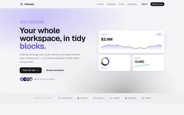
Bento
layoutA modular grid of card-like blocks with clear hierarchy and soft spacing that makes any content feel organized, scannable, and modern.
Application
layoutA developer-first app shell with top-bar navigation, card-based panels, and dense, no-nonsense workflows built for getting things done.
Blocks
layoutA modular, grid-locked system of interlocking geometric panels in vibrant, high-contrast colors that snap together like a precise toy construction set.